Exposed dropdow menusの実装方法を紹介します。
目次
EditText(文字入力を要求するView)の入力候補(Exposed:手持ちの札を陳列する)を表示するメニューです。
※AutoCompleteTextViewはEditTextを継承しています。
Material Design ComponentsのText fieldsカテゴリの方が機能的に近いと思いますが、何故かMenusに属しています。
メニューの実装
Exposed drowdown menusの実装方法を示します。
サンプルの実装
入力候補を表示する機能はAutoCompleteTextViewが元から持っています。
AutoCompleteTextViewはメニュー表示に特化して開発されたクラスではありません。
Exposed dropdown menusは、このAutoCompleteTextViewをMaterial Designの指標に沿って装飾したものです。
メニューのレイアウト
メニューはTextInputLayoutの子ViewにAutoCompleteTextViewを配置した構成になります。
<?xml version="1.0" encoding="utf-8"?>
<androidx.constraintlayout.widget.ConstraintLayout
    ...
    tools:context=".MainActivity">

    <!-- 左上のメニュー -->
	<com.google.android.material.textfield.TextInputLayout
        android:id="@+id/txtInpLay"
        style="@style/Widget.MaterialComponents.TextInputLayout.FilledBox.ExposedDropdownMenu"
        android:layout_width="wrap_content"
        android:layout_height="wrap_content"
        android:hint="Item ?" ...>

        <AutoCompleteTextView
            android:layout_width="match_parent"
            android:layout_height="wrap_content"
            android:inputType="none" />

    </com.google.android.material.textfield.TextInputLayout>

    <!-- 右下のメニュー -->
	<com.google.android.material.textfield.TextInputLayout>
        ...
    </com.google.android.material.textfield.TextInputLayout>

</androidx.constraintlayout.widget.ConstraintLayout>
TextInputLayoutはLinearLayoutを継承していて、EditTextを一つだけ持つことが出来るコンテナタイプのViewです。※EditTextを二つ以上配置するとエラーになります。
このTextInputLayoutがMaterial Designの指標に沿った装飾を担っているラッパーです。
よって、Material Design ComponentsのMenusで紹介されているExposed dropdown menusは、必ず図のような構成になります。
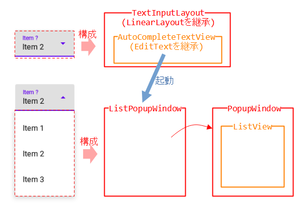
メニューの部分はAutoCompleteTextViewが起動するListPopupWindowです。
ListPopupWindowはPopupWindow(パネルが浮き上がるような表示)とListView(アイテムを一覧表示)を組み合わせたものです。
メニューの組み込み
実装はListViewそのものです。
配列でメニューのアイテムを用意したので、ListAdapterにArrayAdapterを用いています。
メニューのアイテムをListAdapter経由で、AutoCompleteTextViewへ登録するだけです。
<?xml version="1.0" encoding="utf-8"?>
<TextView xmlns:android="http://schemas.android.com/apk/res/android"
    android:layout_width="match_parent"
    android:layout_height="wrap_content"
    android:padding="16dp"
    android:ellipsize="end"
    android:maxLines="1"
    android:textAppearance="?attr/textAppearanceSubtitle1" />
class MainActivity : AppCompatActivity() {
    override fun onCreate(savedInstanceState: Bundle?) {
        super.onCreate(savedInstanceState)
        ...

        val _items = arrayOf("Item 1", "Item 2", "Item 3")
        val _adapter = ArrayAdapter(this, R.layout.menu_item, _items)

        val _textInputlayout = findViewById<TextInputLayout>(R.id.txtInpLay)
        val _editText = _textInputlayout.editText as? AutoCompleteTextView
        _editText?.apply {
            setAdapter(_adapter)
            ...
        }
    }
}
カスタマイズは他のListAdapter(Simple/CursorAdapterなど)を使ったり、アイテムのレイアウトを変更したり、ListViewと同じ方法が使えそうです。
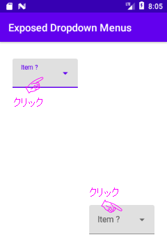
サンプルの実行結果
図は上記で実装したExposed dropdown menusの実行結果です。
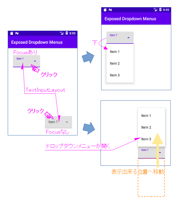
TextInputLayout(クリックに反応するのはAutoCompleteTextView)をクリックすると、その下に左上を起点としたドロップダウンメニューが開いて、アイテムが現れます。
ドロップダウンメニューが画面の外へ出てしまうときは、メニュー全体が表示できる位置へ移動されます。
アイテムのクリックイベント処理
AdapterView.OnItemClickListenerリスナーを実装し、AutoCompleteTextViewオブジェクトへ登録します。
アイテムのクリックが行われるとAdapterView.OnItemClickListenerにコールバックが返ってきます。
引数のpositionがクリックされたアイテムの位置を示しています。後は位置に基づいて処理を行います(サンプルはToastを発行)。
アイテムを一覧表示している部分はListViewなので、イベントの処理方法はListViewと全く同じです。
class MainActivity : AppCompatActivity() {
    ...
    override fun onCreate(savedInstanceState: Bundle?) {
        super.onCreate(savedInstanceState)
		...
        val _items = arrayOf("Item 1", "Item 2", "Item 3")
        val _adapter = ArrayAdapter(this, R.layout.menu_item, _items)

        val _textInputlayout = findViewById<TextInputLayout>(R.id.txtInpLay)
        val _editText = _textInputlayout.editText as? AutoCompleteTextView
        _editText?.apply {
            setAdapter(_adapter)
            setOnItemClickListener { parent, view, position, id ->
                val _item = parent.getItemAtPosition(position) as String
                when(position) {
                    0 -> {  // Item 1の処理
                        Toast.makeText(parent.context, _item, Toast.LENGTH_LONG)
                            .show() }
                    1 -> {  // Item 2の処理
                        Toast.makeText(parent.context, _item, Toast.LENGTH_LONG)
                            .show() }
                    2 -> {  // Item 3の処理
                        Toast.makeText(parent.context, _item, Toast.LENGTH_LONG)
                            .show() }
                    else -> {}
                }
            }
        }

		...
	}
}
スタイルでデザインを変更
先にも述べましたが、TextInputLayoutがMaterial Designの指標に沿った装飾を担っているラッパーです。
TextInputLayoutのスタイルを変更すると、デザインが変えられるようになっています。
	<com.google.android.material.textfield.TextInputLayout
        android:id="@+id/txtInpLay"
        style="@style/Widget.MaterialComponents.TextInputLayout.FilledBox.ExposedDropdownMenu"
        android:layout_width="wrap_content"
        android:layout_height="wrap_content"
        android:hint="Item ?" ...>

        <AutoCompleteTextView
            android:layout_width="match_parent"
            android:layout_height="wrap_content"
            android:inputType="none" />

    </com.google.android.material.textfield.TextInputLayout>
| スタイル名 Widget.MaterialComponents.TextInputLayout.*** | デザイン |
|---|---|
| FilledBox.ExposedDropdownMenu | 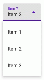 |
| OutlinedBox.ExposedDropdownMenu | 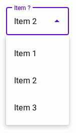 |
関連記事: