アプリを作成していると、高機能化することに力を入れ過ぎて、画面の見栄えや操作性を御座なりにしてしまうことが多々あります。
そんな状態で出来上がったアプリと言えば、
無駄に高機能で、画面がスイッチ・ボタン・状態を知らせるテキストだらけ、「その道の専門家しか使えねぇーよ!」と言いたくなるものだったり…
気分で配色するから、画面が色の入り乱れた”おもちゃ箱”のようで、統一された品がなかったり…
他のアプリと操作方法が異なるので、覚えるのに苦労したり、操作ミスを繰り返したり…
そんな失敗を起こさないように、正しい方向へ強制するツールが「マテリアルデザイン」だと思います。※それだけでは無いです。
今回はマテリアルデザイン対応のプロジェクトについて紹介します。
マテリアルデザインとは
マテリアルデザインとはGoogleが提唱する画面デザインの指標です。
アプリケーションへ統一感のあるデザインと操作性を持たせます。
それにより、
「デバイスが変わった」 ※デバイス:Phone、Tablet、DeskTop PCなど
「プラットフォームが変わった」※プラットフォーム:OS、Webブラウザなどのツール
「アプリが変わった」
上記のような実行環境が変わったとしても、統一感が期待できるので、ストレスなくアプリケーションを操作することが出来ます。
指標の定義はレイアウト・形状・操作・配色・タイポグラフィ・アニメーションなど多岐にわたります。
詳細は本家「Material Design」のページを参照してください。
AndroidはApi21のころからマテリアルデザインを積極的に採り入れてきました。現在、マテリアルデザインが標準です。ただし、強制ではないです。
Android Studioで作成されるプロジェクト
Android Studio(投稿時:Ver4.2.1)で新規プロジェクトを作成すると、デフォルトでマテリアルデザイン対応のプロジェクトが構築されます。
何処がマテリアルデザイン対応なのかというと、次の2つです。
★マテリアルデザイン・テーマが指定される
★マテリアルデザイン・コンポーネントが利用可能になる
後は、アプリの仕様を実装しつつ、マテリアルデザインに沿ったカスタマイズとUI(ユーザインターフェイス)を構築していけば良いようになっています。
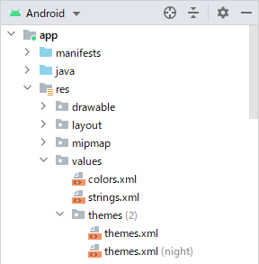
テーマが指定される
図の中にあるthemes.xmlがテーマファイル(テーマの定義ファイル)で、ファイル中にTheme.MaterialComponents.XXXというテーマ名が記述されています。これが、マテリアルデザイン対応のテーマです。
※以前のAndroid Studioはres/values/styles.xmlにテーマが定義されていました。今はthemes.xmlに分離されています。
<resources xmlns:tools="http://schemas.android.com/tools">
    <!-- Base application theme. -->
    <style name="Theme.ResTheme"
	    parent="Theme.MaterialComponents.DayNight.DarkActionBar">
        <!-- Primary brand color. -->
        <item name="colorPrimary">@color/purple_500</item>
        <item name="colorPrimaryVariant">@color/purple_700</item>
        <item name="colorOnPrimary">@color/white</item>
        <!-- Secondary brand color. -->
        <item name="colorSecondary">@color/teal_200</item>
        <item name="colorSecondaryVariant">@color/teal_700</item>
        <item name="colorOnSecondary">@color/black</item>
        <!-- Status bar color. -->
        <item name="android:statusBarColor" tools:targetApi="l">?attr/colorPrimaryVariant</item>
        <!-- Customize your theme here. -->
    </style>
</resources>
themes.xmlへ定義されたテーマが、マニフェストファイルでアプリケーションに設定されています。
<?xml version="1.0" encoding="utf-8"?>
<manifest xmlns:android="http://schemas.android.com/apk/res/android"
    package="com.example.restheme">

    <application
        android:allowBackup="true"
        android:icon="@mipmap/ic_launcher"
        android:label="@string/app_name"
        android:roundIcon="@mipmap/ic_launcher_round"
        android:supportsRtl="true"
        android:theme="@style/Theme.ResTheme">
        <activity android:name=".MainActivity">
            <intent-filter>
                <action android:name="android.intent.action.MAIN" />

                <category android:name="android.intent.category.LAUNCHER" />
            </intent-filter>
        </activity>
    </application>

</manifest>
ちなみに、<applilcation>要素の属性にテーマを記述すると、すべてのActivityで同じテーマが使用されます。
<activity>要素の属性にテーマを記述すると、Activity毎に異なるテーマが使用されます。
コンポーネントが利用可能になる
マテリアルデザイン・コンポーネントとは、名前の通り、マテリアルデザインの指標に沿った、アプリを構成する部品のことです。
コンポーネント群
コンポーネントの大半はMaterialライブラリ(com.google.android.material)内で提供されます。
しかし、そればかりではありません。
色々な形態のものが「コンポーネント」という名前でまとめられています。
形態で分類すれば次のようなものがあります。
・Materialライブラリで提供
-AndroidXライブラリを継承(ラッパー)
-新規構築されたWidgets(View)
・コンポーネントを組み合わせた動作
Button、Toolbarなど
Floating action buttonなど
App barsなど
コンポーネントの種類・詳細は「Components」を参照してください。
ライブラリの指定
ライブラリ依存関係のリストへMaterialライブラリが追加されます。
...
dependencies {
    implementation "org.jetbrains.kotlin:kotlin-stdlib:$kotlin_version"
    implementation 'androidx.core:core-ktx:1.6.0'
    implementation 'androidx.appcompat:appcompat:1.3.1'
    implementation 'com.google.android.material:material:1.4.0'
    implementation 'androidx.constraintlayout:constraintlayout:2.0.4'
    testImplementation 'junit:junit:4.+'
    androidTestImplementation 'androidx.test.ext:junit:1.1.3'
    androidTestImplementation 'androidx.test.espresso:espresso-core:3.4.0'
}
プロジェクト作成で自動的に追加されるので、ユーザは何もする必要はありません。
Materialライブラリ内のコンポーネントが利用可能になります。
暗黙的なコンポーネントの置換
アプリを実装していく中で、適所にマテリアルデザインのコンポーネントを配置して行くことになります。つまり、レイアウトファイル(main_activity.xml)やプログラムで明示的にコンポーネントを使用します。
この明示的な配置とは別に、LayoutInflaterによって暗黙的な置換が行われるコンポーネント(View)があります。次にあげるコンポーネントです。
AutoCompleteTextView
Button
CheckBox
RadioButton
TextView
⇒ MaterialAutoCompleteTextView
⇒ MaterialButton
⇒ MaterialCheckBox
⇒ MaterialRadioButton
⇒ MaterialTextView
これは、Theme.MaterialComponentsテーマを使用している時に起動されるMaterialComponentsViewInflaterによる置換動作です。
実際の動作を調べると次のようになっていました。
        <AutoCompleteTextView
            android:id="@+id/aTextView" ... />
        <TextView
            android:id="@+id/textView" ... />
        <Button
            android:id="@+id/button" ... />
        <CheckBox
            android:id="@+id/checkBox" ... />
        <RadioButton
            android:id="@+id/rButton" ... />
        <ImageView
            android:id="@+id/imageView" ... />
        <ToggleButton
            android:id="@+id/tButton" ... />
        <com.google.android.material.chip.Chip
            android:id="@+id/chip" .../>
        val _aTextView = findViewById<AutoCompleteTextView>(R.id.aTextView)
        val _textView = findViewById<TextView>(R.id.textView)
        val _button = findViewById<Button>(R.id.button)
        val _checkBox = findViewById<CheckBox>(R.id.checkBox)
        val _radioButton = findViewById<RadioButton>(R.id.rButton)
        val _image = findViewById<ImageView>(R.id.imageView)
        val _tButton = findViewById<ToggleButton>(R.id.tButton)
        val _chip = findViewById<Chip>(R.id.chip)

        Log.i(TAG, "R.id.*   :Class Name")
        Log.i(TAG, "-------------------------------------")
        Log.i(TAG, "textView :${_textView.javaClass.name}")
        Log.i(TAG, "aTextView:${_aTextView.javaClass.name}")
        Log.i(TAG, "button   :${_button.javaClass.name}")
        Log.i(TAG, "checkBox :${_checkBox.javaClass.name}")
        Log.i(TAG, "rButton  :${_radioButton.javaClass.name}")

        Log.i(TAG, "imageView:${_image.javaClass.name}")
        Log.i(TAG, "tButton  :${_tButton.javaClass.name}")
        Log.i(TAG, "chip     :${_chip.javaClass.name}")
R.id.*   :Class Name
-------------------------------------
textView :com.google.android.material.textview.MaterialTextView
aTextView:com.google.android.material.textfield.MaterialAutoCompleteTextView
button   :com.google.android.material.button.MaterialButton
checkBox :com.google.android.material.checkbox.MaterialCheckBox
rButton  :com.google.android.material.radiobutton.MaterialRadioButton

imageView:androidx.appcompat.widget.AppCompatImageView
tButton  :androidx.appcompat.widget.AppCompatToggleButton
chip     :com.google.android.material.chip.Chip
※MaterialComponentsViewInflaterはAppCompatViewInflaterを継承しています。
マテリアルデザイン・テーマの種類
アプリケーションに設定できるマテリアルデザイン対応のテーマは8つあります。
(1)Theme.MaterialComponents
(2)Theme.MaterialComponents.NoActionBar
(3)Theme.MaterialComponents.Light
(4)Theme.MaterialComponents.Light.DarkActionBar
(5)Theme.MaterialComponents.Light.NoActionBar
(6)Theme.MaterialComponents.DayNight
(7)Theme.MaterialComponents.DayNight.DarkActionBar
(8)Theme.MaterialComponents.DayNight.NoActionBar

※Theme.AppCompat/Theme.Designe/Theme.*.bridgeなどは取り上げません。
各テーマの特徴をまとめると表のようになります(推奨度は私の個人的な意見です)。
| テーマ名 | 画面 背景色 | アクションバー 有無・背景色 | コメント | 推奨度 | |
|---|---|---|---|---|---|
| Theme | MaterialComponents | なし (暗) | なし (有・暗) | ○ | |
| NoActionBar (無・ー) | △ | ||||
| Light (明) | なし (有・明) | ○ | |||
| DarkActionBar (有・暗) | × | ||||
| NoActionBar (無・ー) | △ | ||||
| DayNight (明暗) | なし (有・明) | ◎ | |||
| DarkActionBar (有・暗) | AndroidStudio デフォルト | × | |||
| NoAationBar (無・ー) | △ | ||||
| (暗)ダークモード:暗い色の背景 (明)ライトモード:明るい色の背景 (明暗):(明)ライトと(暗)ダークモードを切り替え |
|||||
画面背景:ライトモード(Light)
白昼の屋外など周囲が明るい場合、周囲の明るさの影響で端末の画面が暗く見えるために、表示内容が見え難くなります。
これを緩和するには画面を明るい構成にします。ライトモードはこのような場合に有効です。
画面背景:ダークモード(なし)
夜間の屋外など周囲が暗い場合、周囲の暗さの影響で端末の画面がより明るく見えます。
明るい画面は目に対する刺激が大きいため、目を疲労させます。
これを緩和するには画面を暗い構成にします。ダークモードはこのような場合に有効です。
また、有機EL(OELD)は各々の画素が発光する表示デバイスです。画素は輝度が高い(明るい)ほどエネルギーを消費ます。ダークモードは輝度の低い(暗い)画素が多くなるので、低消費電力が期待できます。
画面背景:デイナイトモード(DayNight)
ライトとダークモードの切り替えが可能なモードです。
ただし、切り替えのためのプログラムコードを実装しなければ、ライトモードと同じです。
アクションバー有無(NoActionBar)
アクションバー有の場合であっても、テーマへ次の2行を追加すれば非表示に出来ます。
<resources xmlns:tools="http://schemas.android.com/tools">
    <!-- Base application theme. -->
    <style name="Theme.ResTheme"
	    parent="Theme.MaterialComponents.DayNight">
        ...
        <!-- Customize your theme here. -->
        <!-- アクションバーの非表示(ツールバー置き換えのため) -->
        <item name="windowActionBar">false</item>
        <item name="windowNoTitle">true</item>
    </style>
</resources>
アクションバーを非表示にするために、NoActionBar付きのテーマをあえて選択する利点は小さいと考えます。
アクションバー背景(DarkActionBar)
ブランドカラー
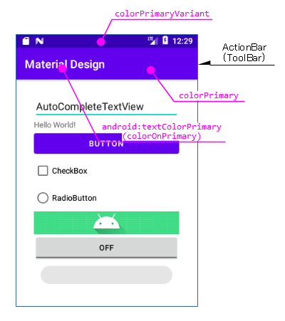
マテリアルデザインはブランドカラーと呼ばれる色を定義(ハイライト部分)するように決められています。
<resources xmlns:tools="http://schemas.android.com/tools">
    <!-- Base application theme. -->
    <style name="Theme.ResTheme"
	    parent="Theme.MaterialComponents.DayNight.DarkActionBar">
        <!-- Primary brand color. -->
        <item name="colorPrimary">@color/purple_500</item>
        <item name="colorPrimaryVariant">@color/purple_700</item>
        <item name="colorOnPrimary">@color/white</item>
        <!-- Secondary brand color. -->
        <item name="colorSecondary">@color/teal_200</item>
        <item name="colorSecondaryVariant">@color/teal_700</item>
        <item name="colorOnSecondary">@color/black</item>
        ...
        <!-- Customize your theme here. -->
        <item name="actionBarTheme">@style/MyActionBar</item>
    </style>

    <style name="MyActionBar" parent="Widget.MaterialComponents.ActionBar.Primary">
        <item name="android:textColorPrimary">?attr/colorOnPrimary</item>
    </style>
</resources>
ブランドカラーとはアプリケーションを特徴付ける色のことです。
ちなみに、プロジェクト作成時に定義されているブランドカラーはベースラインカラーです。デザインの指標を満たした配色の一例として、ドキュメント内に紹介されています。
アクションバー(ツールバー)の配色
マテリアルデザインにおけるアクションバー(ツールバー)の配色はブランドカラーが指定されます。
※( )内はツールバーの場合の属性名
<resources xmlns:tools="http://schemas.android.com/tools">
    <!-- Base application theme. -->
    <style name="Theme.ResTheme"
	    parent="Theme.MaterialComponents.DayNight.DarkActionBar">
        <!-- Primary brand color. -->
        <item name="colorPrimary">@color/purple_500</item>
        <item name="colorPrimaryVariant">@color/purple_700</item>
        <item name="colorOnPrimary">@color/white</item>
        <!-- Secondary brand color. -->
        <item name="colorSecondary">@color/teal_200</item>
        <item name="colorSecondaryVariant">@color/teal_700</item>
        <item name="colorOnSecondary">@color/black</item>
        ...
        <!-- Customize your theme here. -->
        <item name="actionBarTheme">@style/MyActionBar</item>
    </style>

    <style name="MyActionBar" parent="Widget.MaterialComponents.ActionBar.Primary">
        <item name="android:textColorPrimary">?attr/colorOnPrimary</item>
    </style>
</resources>
※Action Barをマテリアルデザインのブランドカラーに対応させるため、actionBarTheme属性へテーマの指定が必要です(Tool Barの場合も同様)。
従って、テーマで指定するアクションバーの背景はブランドカラーで上書きされるため、意味を持ちません。
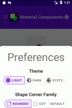
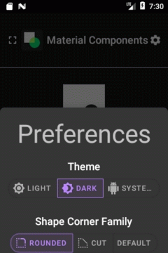
マテリアルデザイン・コンポーネントのデモ
マテリアルデザイン・コンポーネントのデモアプリが用意されています。「Catalog App」といいます。
「どのようなコンポーネントか?」、「何ができるか?」、「記述方法は?」など、コンポーネントについて知りたい時に役立ちます。
デモの起動は至って簡単です。
まづは、Gitにより最新版を入手します。
git clone https://github.com/material-components/material-components-android.git
入手したプロジェクトをAndroid Studioで開き、ビルドを行えばエミュレータで実行できます。
関連記事: