Android SDKは様々なViewコンポーネント(TextView, Button, ImageViewなど)を含んでいます。
これだけで、十分に見栄えのあるアプリが開発できます。
ですが、全ての人やアプリの要望に対応することは難しく、アプリ開発中に「こんなViewが欲しい!」と思える場面があります。
そのような場合はカスタムビューの作成を検討してみましょう。「なければ作ってしまえ!」という訳です。
ここでは、「カスタムビューの属性の定義と指定方法」をまとめます。
※環境:Android Studio Flamingo | 2022.2.1
ビュー(View)の属性
図に示すように、ビュー(TextView)は様々な値によって表現されています。
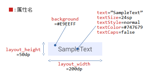
この値を「ビューの属性(Attributes)」といいます。また、属性は「属性名」を持ちます。
指定方法
表は属性の指定方法です。大きく分けて5つあります。
| 優先度 | 指定単位 | 指定対象 | 指定先 | 静・動 | |
|---|---|---|---|---|---|
| Immediate | 各々の属性 | View | クラスのプロパティ | ||
| Layout | レイアウトファイル | ||||
| Style | 複数の属性 | ||||
| Theme | Activity | マニフェストファイル | |||
| Default | 各々の属性 | View | クラスのプロパティ(初期値) | ||
| ※優先度:1(高)~5(低) | |||||
※Immediate:「カスタムビュー作成1:Viewの継承と…」で取り上げています。
※Layout:本記事で取り上げています。
※Style:「カスタムビュー作成4:ビューの属性をスタイル…」で取り上げています。
※Theme:同上
※Default:Viewクラスのプロパティ初期値による動作です。
属性のタイプ
表は使用可能な属性のタイプです。
| 属性タイプ | 内容 | データの型 | 属性値の例 |
|---|---|---|---|
| integer | Int型の数値 | Int | 20 @integer/xxxx |
| float | Float型の数値 | Float | 3.14 ※fは付けない |
| string | Sting型の文字列 | String | "Hello" @string/xxxx |
| boolean | Boolean型の真理値 | Boolean | true, false @bool/xxxx |
| dimension | 寸法(単位付き可) | Float | 240dp, 240px, 20sp @dimen/xxxx |
| color | ARGB(32bit)の色情報 | Int | #FF0000 @color/red |
| reference | リソース | Drawable Int String Int Boolean ... | @drawable/xxxx @color/xxxx @string/xxxx @integer/xxxx @bool/xxxx ... |
| fraction | 割合 | Float | 50%, 25%p @fraction/xxxx |
| flags | フラグのon / off | Int | bit0→0000_0001b (2^0=1) bit4→0001_0000b (2^4=16) bit4 | bit0→0001_0001b(1+16=17) |
| enum | 整数の列挙 | Int | {ten:10, twenty:20, thirty:30} |
各タイプの詳細は「カスタムビュー作成3:ビューの属性のタイプと使用例」を参照してください。
属性の定義
属性はattrs(values/attrs.xml)ファイルに、以下のようなフォーマットで定義します。
<?xml version="1.0" encoding="utf-8"?>
<resources>
    <declare-styleable name="クラス名A">
        <attr name="属性名1" format="属性タイプ" />   ... 属性名の定義
			:
    </declare-styleable>
	<declare-styleable name="クラス名B">
        <attr name="属性名2" format="属性タイプ" />   ... 属性名の定義
			:
    </declare-styleable>
</resources>
<?xml version="1.0" encoding="utf-8"?>
<resources>
	<attr name="属性名" format="属性タイプ" />     ... 属性名の定義
    <declare-styleable name="クラス名A">
        <attr name="属性名" />                     ... 属性名の使い回し
			:
    </declare-styleable>
	<declare-styleable name="クラス名B">
        <attr name="属性名" />                     ... 属性名の使い回し
			:
    </declare-styleable>
</resources>
任意の名前が付けられます。
カスタムビューのクラス名にするのが良いです。attr要素で定義された属性名とカスタムビューが関連付けられて、Android Studioに認識されます。ですので、後々、便利です。
「属性名」任意の名前が付けられます。
attrsファイル内で一度定義した属性名は、重複して定義できません。単独で定義された属性名を使い回すことは可能です。
「属性タイプ」integer、float、stringなどが指定できます。
以下は、attrsファイルの例です。
<?xml version="1.0" encoding="utf-8"?>
<resources>
    <declare-styleable name="CustomView">
        <attr name="prm1" format="string" />
        <attr name="prm2" format="integer" />
    </declare-styleable>
</resources>
属性の指定
定義された属性は“http://…/res-auto”という名前空間に集約されています。これを名前空間の定義(xmlns)で“app”という接頭辞に割り当てています。
ですので、属性の指定は「app:属性名=”値”」になります。
以下は、レイアウトファイルの例です。
<?xml version="1.0" encoding="utf-8"?>
<androidx.constraintlayout.widget.ConstraintLayout
	xmlns:android="http://schemas.android.com/apk/res/android"
    xmlns:app="http://schemas.android.com/apk/res-auto"
    xmlns:tools="http://schemas.android.com/tools"
    android:layout_width="match_parent"
    android:layout_height="match_parent"
    tools:context=".MainActivity">

	...
    <カスタムビューのクラス名.CustomView
        android:id="@+id/customView4"
        android:layout_width="100dp"
        android:layout_height="100dp"
        app:layout_constraintBottom_toBottomOf="parent"
        app:layout_constraintEnd_toEndOf="parent"
        app:layout_constraintStart_toStartOf="parent"
        app:layout_constraintTop_toTopOf="parent"
        app:prm1="April"
        app:prm2="2023" />
	...

</androidx.constraintlayout.widget.ConstraintLayout>
属性の参照
コンストラクタのattrs引数はレイアウトファイルのカスタムビューに指定された全属性に対する参照先を持ちます。
attrsからインデックス(R.styleable.CustomView)を使って、カスタムビュー階層の属性(祖先のビューの属性は含まない)を取得します。
参照は属性のタイプに適した関数(getInt, getStringなど)を使用します。
class CustomView @JvmOverloads constructor(
    context: Context,
    attrs: AttributeSet? = null,
    defStyleAttr: Int = 0,
    defStyleRes: Int = 0
) : View(context, attrs, defStyleAttr, defStyleRes) {

    private var prm1: String?
    private var prm2: Int

    init {
        context.obtainStyledAttributes(                            // 属性の取得
            attrs, R.styleable.CustomView5, defStyleAttr, defStyleRes)
            .apply {
                try {
                    prm1 = getString(R.styleable.CustomView_prm1)  // 属性の参照
                    prm2 = getInt(R.styleable.CustomView_prm2, -1) // 属性の参照
                }
                finally {
                    recycle()   // 最後にTypedArrayインスタンスを開放
                }
            }
    }

	...
}
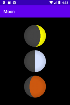
例:Moon
カスタムビューの例として、「Moon(月)」を作成してみました。
Moonは3つの属性を持ちます。age属性は月の欠け具合を、noonColor・nightColor属性は月の色合いを変更できます。
<?xml version="1.0" encoding="utf-8"?>
<resources>
    <declare-styleable name="Moon">
        <attr name="age" format="float" />
        <attr name="noonColor" format="color" />
        <attr name="nightColor" format="color" />
    </declare-styleable>
</resources>
<?xml version="1.0" encoding="utf-8"?>
<resources>
    <color name="blue_moon">#D5E1FF</color>
    <color name="blood_moon">#CC5810</color>
</resources>
class Moon @JvmOverloads constructor(
    context: Context,
    attrs: AttributeSet? = null,
    defStyleAttr: Int = 0,
    defStyleRes: Int = 0
) : View(context, attrs, defStyleAttr, defStyleRes) {

    var age: Float = 0.0f
        set(value) {
            field = value
            invalidate()    // onDrawの再実行を依頼
        }
    var noonColor: Int = Color.YELLOW
        set(value) {
            field = value
            invalidate()    // onDrawの再実行を依頼
        }
    var nightColor: Int = Color.YELLOW
        set(value) {
            field = value
            invalidate()    // onDrawの再実行を依頼
        }

    init {
        context.obtainStyledAttributes(
		    attrs, R.styleable.Moon, defStyleAttr, defStyleRes)
            .apply {
                try {
                    age = getFloat(R.styleable.Moon_age, 0.0f)
                    noonColor = getColor(R.styleable.Moon_noonColor, Color.YELLOW)
                    nightColor = getColor(R.styleable.Moon_nightColor, Color.DKGRAY)
                }
                finally {
                    recycle()
                }
            }
    }

    override fun onDraw(canvas: Canvas?) {
        super.onDraw(canvas)
        // Viewの描画を行う

        if(canvas == null) return
        if((canvas.width <= 0) or (canvas.height <= 0)) return

        val _width = canvas.width.toFloat()
        val _heigjt = canvas.height.toFloat()
        val _centerX = _width / 2.0f
        val _centerY = _heigjt / 2.0f
        val _diameter = if(_width < height) _width else _heigjt
        val _radius = _diameter / 2.0f

        val _paintNoon = Paint().apply { setColor(noonColor) }
        val _paintNight = Paint().apply { setColor(nightColor) }
        val _colors = intArrayOf(0x00000000, 0x00000000, 0x20000000,)
        val _stops = floatArrayOf(0.0f, 0.6f, 1.0f)
        val _shader = RadialGradient(
            _centerX, _centerY, _radius,
            _colors, _stops, Shader.TileMode.CLAMP
        )
        val _paintEdge = Paint().apply {setShader(_shader) }

        val _fullMoon = RectF(
            _centerX - _radius, _centerY - _radius,     // top, left
            _centerX + _radius, _centerY + _radius      // bottom, right
        )
        val _ageAngle = (PI.toFloat() * 2.0f) / 30.0f * age
        val _waneWidth = abs(cos(_ageAngle) * _radius)
        val _halfMoon = RectF(
            _centerX - _waneWidth, _centerY - _radius,  // top, left
            _centerX + _waneWidth, _centerY + _radius   // bottom, right
        )

        when {
            (_ageAngle <= PI * 0.5f) -> {
                canvas.drawArc(_fullMoon, 90.0f,180.0f,false, _paintNight)  // 左半分
                canvas.drawArc(_fullMoon,270.0f,180.0f,false, _paintNoon)   // 右半分
                canvas.drawArc(_halfMoon,  0.0f,360.0f,false, _paintNight)  // 右半分
            }
            (_ageAngle <= PI) -> {
                canvas.drawArc(_fullMoon, 90.0f,180.0f,false, _paintNight)  // 左半分
                canvas.drawArc(_fullMoon,270.0f,180.0f,false, _paintNoon)   // 右半分
                canvas.drawArc(_halfMoon,  0.0f,360.0f,false, _paintNoon)   // 左半分
            }
            (_ageAngle <= PI * 1.5f) -> {
                canvas.drawArc(_fullMoon, 90.0f,180.0f,false, _paintNoon)   // 左半分
                canvas.drawArc(_fullMoon,270.0f,180.0f,false, _paintNight)  // 右半分
                canvas.drawArc(_halfMoon,  0.0f,360.0f,false, _paintNoon)   // 右半分
            }
            (_ageAngle <= PI * 2.0f) -> {
                canvas.drawArc(_fullMoon, 90.0f,180.0f,false, _paintNoon)   // 左半分
                canvas.drawArc(_fullMoon,270.0f,180.0f,false, _paintNight)  // 右半分
                canvas.drawArc(_halfMoon,  0.0f,360.0f,false, _paintNight)  // 左半分
            }
            else -> {
                canvas.drawArc(_fullMoon,  0.0f,360.0f,false, _paintNight)  // 全周
            }
        }
        canvas.drawArc(_fullMoon,0.0f,360.0f,false, _paintEdge)             // 全周
    }
}
属性を定義するだけで、Android Studioのレイアウトエディタから参照できるようになります。とても便利です。
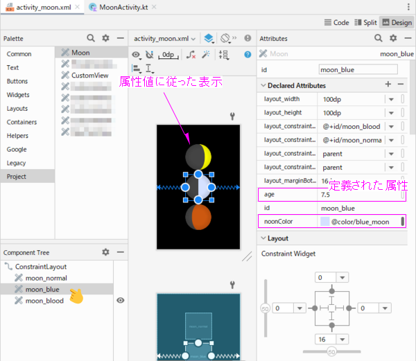
<?xml version="1.0" encoding="utf-8"?>
<androidx.constraintlayout.widget.ConstraintLayout
    xmlns:android="http://schemas.android.com/apk/res/android"
    xmlns:app="http://schemas.android.com/apk/res-auto"
    ...
    tools:context=".MoonActivity">

    <カスタムビューのパッケージ名.Moon
        android:id="@+id/moon_normal"
        android:layout_width="100dp"
        android:layout_height="100dp"
		...
        app:age="5.0" />

    <カスタムビューのパッケージ名.Moon
        android:id="@+id/moon_blue"
        android:layout_width="100dp"
        android:layout_height="100dp"
		...
        app:age="7.5"
        app:noonColor="@color/blue_moon" />

    <カスタムビューのパッケージ名.Moon
        android:id="@+id/moon_blood"
        android:layout_width="100dp"
        android:layout_height="100dp"
		...
        app:age="10.0"
        app:noonColor="@color/blood_moon" />

</androidx.constraintlayout.widget.ConstraintLayout>
プログラム上の扱いは既存のViewと全く変わりません。
属性は全てレイアウトファイルへ指定し、静的な表示を行っています。ですので、カスタムビューのプロパティはプログラムで操作していません。
class MainActivity : AppCompatActivity() {
    override fun onCreate(savedInstanceState: Bundle?) {
        super.onCreate(savedInstanceState)
        setContentView(R.layout.activity_moon)
    }
}
関連記事: