Android SDKは様々なViewコンポーネント(TextView, Button, ImageViewなど)を含んでいます。
これだけで、十分に見栄えのあるアプリが開発できます。
ですが、全ての人やアプリの要望に対応することは難しく、アプリ開発中に「こんなViewが欲しい!」と思える場面があります。
そのような場合はカスタムビューの作成を検討してみましょう。「なければ作ってしまえ!」という訳です。
ここでは、「カスタムビューの属性のタイプと使用例」をまとめます。
※環境:Android Studio Flamingo | 2022.2.1
属性のタイプ
表は使用可能な属性のタイプです。
| 属性タイプ | 内容 | データの型 | 属性値の例 |
|---|---|---|---|
| integer | Int型の数値 | Int | 20 @integer/xxxx |
| float | Float型の数値 | Float | 3.14 ※fは付けない |
| string | Sting型の文字列 | String | "Hello" @string/xxxx |
| boolean | Boolean型の真理値 | Boolean | true, false @bool/xxxx |
| dimension | 寸法(単位付き可) | Float | 240dp, 240px, 20sp @dimen/xxxx |
| color | ARGB(32bit)の色情報 | Int | #FF0000 @color/red |
| reference | リソース | Drawable Int String Int Boolean ... | @drawable/xxxx @color/xxxx @string/xxxx @integer/xxxx @bool/xxxx ... |
| fraction | 割合 | Float | 50%, 25%p @fraction/xxxx |
| flags | フラグのon / off | Int | bit0→0000_0001b (2^0=1) bit4→0001_0000b (2^4=16) bit4 | bit0→0001_0001b(1+16=17) |
| enum | 整数の列挙 | Int | {ten:10, twenty:20, thirty:30} |
※リソースについては「リソースタイプの概要」を参照してください。
integer
Int型の数値を扱うタイプです。
属性の定義
<?xml version="1.0" encoding="utf-8"?>
<resources>
    <declare-styleable name="CustomView">
        <attr name="cstInteger1" format="integer" />
        <attr name="cstInteger2" format="integer" />
    </declare-styleable>
</resources>
integerリソースを定義すれば、リソースの指定ができます。
<?xml version="1.0" encoding="utf-8"?>
<resources>
    <integer name="Level_L">20</integer>
    <integer name="Level_H">30</integer>
</resources>
    <カスタムビューのパッケージ名.CustomView
        ...
        app:cstInteger1="10"
        app:cstInteger2="@integer/Level_H"
        ... />
    	private var cstInteger1: Int
    	private var cstInteger2: Int

		context.obtainStyledAttributes(attrs, R.styleable.CustomView)
            .apply {
                try {
                    cstInteger1 = getInt(R.styleable.CustomView_cstInteger1, 0)
                    cstInteger2 = getInt(R.styleable.CustomView_cstInteger2, 0)
                    System.out.println("Integer = ${cstInteger1}")
                    System.out.println("Integer = ${cstInteger2}")
                }
                finally {
                    recycle()
                }
            }
I/System.out: Integer = 10
I/System.out: Integer = 30
float
Float型の数値を扱うタイプです。
属性の定義
<?xml version="1.0" encoding="utf-8"?>
<resources>
    <declare-styleable name="CustomView">
        <attr name="cstFloat" format="float" />
    </declare-styleable>
</resources>
floatリソースは存在しません。ですので、リソースの指定はできません。
    <カスタムビューのパッケージ名.CustomView
        ...
        app:cstFloat="3.14"   ... 'f'は不要
        ... />
    	private var cstFloat: Float

		context.obtainStyledAttributes(attrs, R.styleable.CustomView)
            .apply {
                try {
                    cstFloat = getFloat(R.styleable.CustomView_cstFloat, 0.0f)
                    System.out.println("Float = ${cstFloat}")
                }
                finally {
                    recycle()
                }
            }
I/System.out: Float = 3.14
string
String型の文字列を扱うタイプです。
属性の定義
<?xml version="1.0" encoding="utf-8"?>
<resources>
    <declare-styleable name="CustomView">
        <attr name="cstString1" format="string" />
        <attr name="cstString2" format="string" />
    </declare-styleable>
</resources>
stringリソースを定義すれば、リソースの指定ができます。
<?xml version="1.0" encoding="utf-8"?>
<resources>
    <string name="attr_test">Attribute Test</string>
</resources>
    <カスタムビューのパッケージ名.CustomView
        ...
        app:cstString1="Hello"
        app:cstString2="@string/attr_test"
        ... />
アプリの多国語対応のために、リソースによる指定が推奨されています。
属性の参照
    	private var cstString1: String?
    	private var cstString2: String?

		context.obtainStyledAttributes(attrs, R.styleable.CustomView)
            .apply {
                try {
                    cstString1 = getString(R.styleable.CustomView_cstString1)
                    cstString2 = getString(R.styleable.CustomView_cstString2)
                    System.out.println("String = ${cstString1}")
                    System.out.println("String = ${cstString2}")
                }
                finally {
                    recycle()
                }
            }
I/System.out: String = Hello
I/System.out: String = Attribute Test
boolean
Boolean型の真理値を扱うタイプです。
属性の定義
<?xml version="1.0" encoding="utf-8"?>
<resources>
    <declare-styleable name="CustomView">
        <attr name="cstBoolean1" format="boolean" />
        <attr name="cstBoolean2" format="boolean" />
    </declare-styleable>
</resources>
boolリソースを定義すれば、リソースの指定ができます。
<?xml version="1.0" encoding="utf-8"?>
<resources>
    <bool name="CheckPass">true</bool>
    <bool name="CheckErr">false</bool>
</resources>
    <カスタムビューのパッケージ名.CustomView
        ...
        app:cstBoolean1="true"
        app:cstBoolean2="@bool/CheckErr"
        ... />
    	private var cstBoolean1: Boolean
    	private var cstBoolean2: Boolean

		context.obtainStyledAttributes(attrs, R.styleable.CustomView)
            .apply {
                try {
                    cstBoolean1 = getBoolean(R.styleable.CustomView_cstBoolean1, false)
                    cstBoolean2 = getBoolean(R.styleable.CustomView_cstBoolean2, true)
                    System.out.println("Boolean = ${cstBoolean1}")
                    System.out.println("Boolean = ${cstBoolean2}")
                }
                finally {
                    recycle()
                }
            }
I/System.out: Boolean = true
I/System.out: Boolean = false
dimension
Float型の寸法を扱うタイプです。
属性の定義
<?xml version="1.0" encoding="utf-8"?>
<resources>
    <declare-styleable name="CustomView">
        <attr name="cstDimension1" format="dimension" />
        <attr name="cstDimension2" format="dimension" />
        <attr name="cstDimension3" format="dimension" />
        <attr name="cstDimension4" format="dimension" />
    </declare-styleable>
</resources>
dimenリソースを定義すれば、リソースの指定ができます。
<?xml version="1.0" encoding="utf-8"?>
<resources>
    <dimen name="WinWidth">120dp</dimen>
    <dimen name="WinHeight">180dp</dimen>
</resources>
    <カスタムビューのパッケージ名.CustomView
        ...
        app:cstDimension1="240dp"
        app:cstDimension2="240px"
        app:cstDimension3="20sp"
        app:cstDimension4="@dimen/WinHeight"
        ... />
    	private var cstDimention1: Float
    	private var cstDimention2: Float
    	private var cstDimention3: Float
    	private var cstDimention4: Float

		context.obtainStyledAttributes(attrs, R.styleable.CustomView)
            .apply {
                try {
                    cstDimention1 = getDimension(R.styleable.CustomView_cstDimension1, 0.0f)
                    cstDimention2 = getDimension(R.styleable.CustomView_cstDimension2, 0.0f)
                    cstDimention3 = getDimension(R.styleable.CustomView_cstDimension3, 0.0f)
                    cstDimention4 = getDimension(R.styleable.CustomView_cstDimension4, 0.0f)
                    System.out.println("Dimension = ${cstDimention1}")
                    System.out.println("Dimension = ${cstDimention2}")
                    System.out.println("Dimension = ${cstDimention3}")
                    System.out.println("Dimension = ${cstDimention4}")
                }
                finally {
                    recycle()
                }
            }
【mdpの端末】
I/System.out: Dimension = 240.0
I/System.out: Dimension = 240.0
I/System.out: Dimension = 20.0
I/System.out: Dimension = 180.0
【hdpの端末】
I/System.out: Dimension = 360.0
I/System.out: Dimension = 240.0
I/System.out: Dimension = 30.0
I/System.out: Dimension = 270.0
5インチサイズのスクリーンでも、720×1280であったり、1080×1920であったりします。
例えば、100×100ピクセルの画像を表示した場合、前者のスクリーンは大きく見え、後者のスクリーンは小さく見えます。これは、1×1ピクセルの物理的なサイズが解像度により異なるためです。
これは、アプリ開発者とって不便です。どのような画面解像度であってもアプリの見栄えを統一するためには、全世界で販売される全ての端末の解像度に合わせて、画面構成を調整する必要があるからです。
この問題を解決するために、密度非依存ピクセルと呼ばれる論理ピクセルを設けています。
| 画面解像度 | 密度修飾子 | 倍率 | 論理ピクセル [dp,sp] | 物理ピクセル [px] |
|---|---|---|---|---|
| 低密度、~120dpi | ldp | 0.75 | 48 x 48 | 36 x 36 |
| 中密度、~160dpi | mdp(基準) | 1.0 | 48 x 48 | |
| 高密度、~240dpi | hdp | 1.5 | 72 x 72 | |
| 超高密度、~320dpi | xhdp | 2.0 | 96 x 96 | |
| 超超高密度、~480dpi | xxhdp | 3.0 | 144 x 144 | |
| 超超超高密度、~640dpi | xxxhdp | 4.0 | 192 x 192 | |
| ※倍率:論理⇒物理ピクセルの変換倍率 ※dpi(dots per inch):1インチあたりの物理ピクセル数 ※dp(density-independent pixel):密度非依存ピクセル(論理ぴくセイル)、mdpが基準 ※sp(scale-independent pixel):同上、フォントサイズ向け ※px(pixel):物理ピクセル |
||||
この論理ピクセルを寸法の指定に使えば、どのような画面解像度の端末であったとしても、ほぼ同じ画面構成のアプリが開発できます。
ただし、物理ピクセル⇔論理ピクセル間のサイズ換算が必要になります。これは寸法の単位(dp,px,sp)を付加しておけば、ある程度はシステム側が換算処理を行ってくれます。
color
Int型の色情報(ARGB)を扱うタイプです。
属性の定義
<?xml version="1.0" encoding="utf-8"?>
<resources>
    <declare-styleable name="CustomView">
        <attr name="cstColor1" format="color" />
        <attr name="cstColor2" format="color" />
    </declare-styleable>
</resources>
colorリソースを定義すれば、リソースの指定ができます。
<?xml version="1.0" encoding="utf-8"?>
<resources>
    <color name="purple_200">#FFBB86FC</color>
</resources>
    <カスタムビューのパッケージ名.CustomView
        ...
        app:cstColor1="#FF0000"
        app:cstColor2="@color/purple_200"
        ... />
    	private var cstColor1: Int
    	private var cstColor2: Int

		context.obtainStyledAttributes(attrs, R.styleable.CustomView)
            .apply {
                try {
                    cstColor1 = getColor(R.styleable.CustomView_cstColor1, Color.BLACK)
                    cstColor2 = getColor(R.styleable.CustomView_cstColor2, Color.BLACK)
                    System.out.println("Color = %08x".format(cstColor1))
                    System.out.println("Color = %08x".format(cstColor2))
                }
                finally {
                    recycle()
                }
            }
I/System.out: Color = ffff0000
I/System.out: Color = ffbb86fc
reference
様々なリソースを扱うタイプです。
属性の定義
<?xml version="1.0" encoding="utf-8"?>
<resources>
    <declare-styleable name="CustomView">
        <attr name="cstReference1" format="reference" />
        <attr name="cstReference2" format="reference" />
        <attr name="cstReference3" format="reference" />
        <attr name="cstReference4" format="reference" />
    </declare-styleable>
</resources>
定義済みリソースの指定ができます。
    <カスタムビューのパッケージ名.CustomView
        ...
        app:cstReference1="@+id/txtView"    ... layout/activity_main.xml内のViewのID
        app:cstReference2="@drawable/ic_contact_picture_2" ... drawable/*.pngファイル
        app:cstReference3="@string/attr_test"   ... 「属性の使用例(string)」を参照
        app:cstReference4="@color/purple_200"   ... 「属性の使用例(color)」を参照
        ... />
    	private var cstReference1: Int
    	private var cstReference2: Drawable?
    	private var cstReference3: String?
    	private var cstReference4: Int

		context.obtainStyledAttributes(attrs, R.styleable.CustomView)
            .apply {
                try {
                    cstReference1 = getResourceId(R.styleable.CustomView_cstReference1, -1)
                    cstReference2 = getDrawable(R.styleable.CustomView_cstReference2)
                    cstReference3 = getString(R.styleable.CustomView_cstReference3)
                    cstReference4 = getColor(R.styleable.CustomView_cstReference4, Color.BLACK)
                    System.out.println("Reference = ${cstReference1}")
                    System.out.println("Reference = ${cstReference2}")
                    System.out.println("Reference = ${cstReference3}")
                    System.out.println("Reference = %08x".format(cstReference4))
                }
                finally {
                    recycle()
                }
            }
I/System.out: Reference = 2131296746
I/System.out: Reference = android.graphics.drawable.BitmapDrawable@e2498cb
I/System.out: Reference = Attribute Test
I/System.out: Reference = ffbb86fc
fraction
Float型の割合を扱うタイプです。
属性の定義
<?xml version="1.0" encoding="utf-8"?>
<resources>
    <declare-styleable name="CustomView">
        <attr name="cstFraction1" format="fraction" />
        <attr name="cstFraction2" format="fraction" />
        <attr name="cstFraction3" format="fraction" />
        <attr name="cstFraction4" format="fraction" />
    </declare-styleable>
</resources>
fractionリソースを定義すれば、リソースの指定ができます。
<?xml version="1.0" encoding="utf-8"?>
<resources>
    <fraction name="OneQuarter">25%</fraction>
    <fraction name="TreeQuarters">75%p</fraction>
</resources>
    <カスタムビューのパッケージ名.CustomView
        ...
        app:cstFraction1="30%"
        app:cstFraction2="60%p"
        app:cstFraction3="@fraction/OneQuarter"
        app:cstFraction4="@fraction/TreeQuarters"
        ... />
fractionタイプは参照の仕方が特殊です。
getFraction( )関数の引数は次のようになっています。
getFraction(
    index,    ... 属性のインデックス
    base,     ... 基準値、(1)属性値が"**%"の時、 base  * fractionを返す
    pbase,    ... 基準値、(2)属性値が"**%p"の時、pbase * fractionを返す
    default   ... デフォルト
)
属性値が「**%」または「**%p」(’p’の有り無し)で、返される値が(1)または(2)に切り替わります。
また、値は基準値とfraction(例えば25%ならば0.25)を乗算したものになります。
    	private var cstFraction1: Float
    	private var cstFraction2: Float
    	private var cstFraction3: Float
    	private var cstFraction4: Float

		context.obtainStyledAttributes(attrs, R.styleable.CustomView)
            .apply {
                try {
                    cstFraction1 = getFraction(R.styleable.CustomView_cstFraction1, 1, 480, 0.0f)
                    cstFraction2 = getFraction(R.styleable.CustomView_cstFraction2, 1, 480, 0.0f)
                    cstFraction3 = getFraction(R.styleable.CustomView_cstFraction3, 1, 480, 0.0f)
                    cstFraction4 = getFraction(R.styleable.CustomView_cstFraction4, 1, 480, 0.0f)
                    System.out.println("Fraction = ${cstFraction1}")
                    System.out.println("Fraction = ${cstFraction2}")
                    System.out.println("Fraction = ${cstFraction3}")
                    System.out.println("Fraction = ${cstFraction4}")
                }
                finally {
                    recycle()
                }
            }
I/System.out: Fraction = 0.29999995    ... 1 * 0.3
I/System.out: Fraction = 288.0         ... 480 * 0.6
I/System.out: Fraction = 0.25          ... 1 * 0.25
I/System.out: Fraction = 360.0         ... 480 * 0.75
flags
Int型のビットフラグを扱うタイプです。
属性の定義flagsは属性の論理和をとることができます。ですので、valueはビットに意味を持たせたビットフラグにすると、後々に便利です。
<?xml version="1.0" encoding="utf-8"?>
<resources>
    <declare-styleable name="CustomView">
        <attr name="cstFlag" format="flags">
            <flag name="bit0" value="1" />    ... 0000_0001b
            <flag name="bit1" value="2" />    ... 0000_0010b
            <flag name="bit2" value="4" />    ... 0000_0100b
            <flag name="bit3" value="8" />    ... 0000_1000b
            <flag name="bit4" value="16" />   ... 0001_0000b
            <flag name="bit5" value="32" />   ... 0010_0000b
            <flag name="bit6" value="64" />   ... 0100_0000b
            <flag name="bit7" value="128" />  ... 1000_0000b
            <flag name="all" value="255" />   ... 1111_1111b
        </attr>
    </declare-styleable>
</resources>
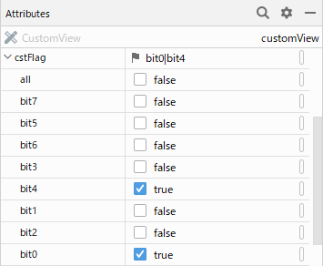
Android Studioのレイアウトエディタにフラグが認識され、個別にon/offの切り替えが可能です。
フラグの論理和をとることができます。
    <カスタムビューのパッケージ名.CustomView
        ...
        app:cstFlag="bit0|bit4"
        ... />
    	private var cstFlag: Int

		context.obtainStyledAttributes(attrs, R.styleable.CustomView)
            .apply {
                try {
                    cstFlag = getInt(R.styleable.CustomView_cstFlag, 255)
                    System.out.println("Flag = ${cstFlag}")
                }
                finally {
                    recycle()
                }
            }
I/System.out: Flag = 17 ... (0000_0001b|0001_0000b) = 0001_0001b (17)
enum
Int型の列挙(Enum)を扱うタイプです。
属性の定義valueに定義できるのは整数のみです。他の型は使用できません。
<?xml version="1.0" encoding="utf-8"?>
<resources>
    <declare-styleable name="CustomView">
        <attr name="cstEnum" format="enum">
            <enum name="nhk1" value="594" />
            <enum name="nhk2" value="693" />
            <enum name="tbs" value="954" />
            <enum name="bunka" value="1134" />
            <enum name="nippon" value="1242" />
        </attr>
    </declare-styleable>
</resources>
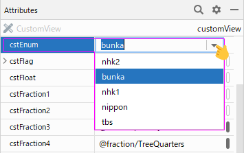
Android Studioのレイアウトエディタに列挙子が認識され、選択が可能です。
    <カスタムビューのパッケージ名.CustomView
        ...
        app:cstEnum="bunka"
        ... />
    	private var cstEnum: Int

		context.obtainStyledAttributes(attrs, R.styleable.CustomView)
            .apply {
                try {
                    cstEnum = getInt(R.styleable.CustomView_cstEnum, 0)
                    System.out.println("Enum = ${cstEnum}")
                }
                finally {
                    recycle()
                }
            }
I/System.out: Enum = 1134
関連記事: