Jetpack composeは、アプリ開発に必要な一通りのUIコンポーネントをライブラリで提供しています。
そのライブラリ中のButtonについて、構成や使用方法などをまとめます。
※環境:Android Studio Flamingo | 2022.2.1
:androidx.compose.material3:material3:1.1.1
:androidx.compose.ui:ui:1.4.3
目次
UIの概要
Buttonはクリック可能なボタンを表現するUI要素です。
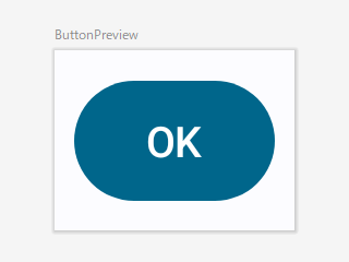
クリックすることでイベントが発生し、引数onClickで指定された関数オブジェクト(ラムダ式)が実行されます。
@Preview(showBackground = true)
@Composable
fun ButtonPreview() {
    Button(onClick = { /*ラムダ式*/ }) {
        Text(text = "OK")
    }
}
関数の引数
Buttonの状態(コンテンツ、装飾、演出など)は、引数により指定できます。
@Composable
fun Button(
    onClick: () -> Unit,
    modifier: Modifier = Modifier,
    enabled: Boolean = true,
    shape: Shape = ButtonDefaults.shape,
    colors: ButtonColors = ButtonDefaults.buttonColors(),
    elevation: ButtonElevation? = ButtonDefaults.buttonElevation(),
    border: BorderStroke? = null,
    contentPadding: PaddingValues = ButtonDefaults.ContentPadding,
    interactionSource: MutableInteractionSource = remember { MutableInteractionSource() },
    content: @Composable RowScope.() -> Unit
)
| 引数 | 概要 | |
|---|---|---|
| onClick | ( )->Unit | クリックで実行する関数オブジェクト(ラムダ式) |
| modifier | Modifier | UI全般のCompose修飾子 |
| enabled | Boolean | UIの有効:true/無効:false ※有効⇒クリック可能、無効⇒クリック不可 |
| shape | Shape | 角の形状 |
| colors | ButtonColors | 有効/無効(enabled)に合わせた色の情報 |
| elevation | ButtonElevation | 状態(Press/Focus/...)に合わせた高さの情報 |
| border | BorderStroke | 輪郭 |
| contentPadding | PaddingValues | content周りの余白 |
| interactionSource | MutableInteractionSource | ユーザが行ったUI操作の観測と報告 |
| content | RowScopw.( )->Unit | ボタンに表示する文字・アイコン |
関数の構成
ButtonはSurfaceとRowを重ね合わせた構成になっています。Rowはインライン関数なので展開されて階層は残りません。ですので、Buttonの実態はSurfaceであると言えます。
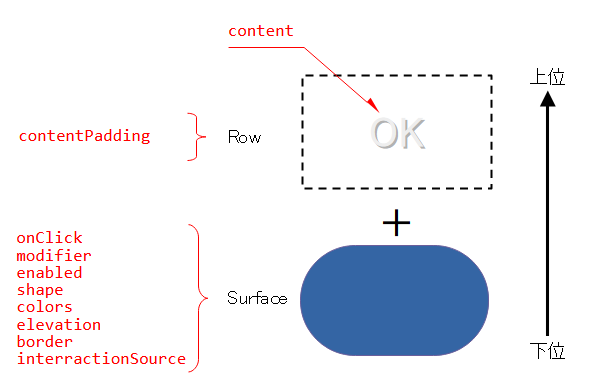
content(ボタンに表示する文字・アイコン)はRowに入るので、横並びの配置になります。
クリック処理
ボタンなのでクリックすることでイベントが発生します。
イベントに反応して、引数onClickで指定された関数オブジェクト(ラムダ式)が実行されます。
class MainActivity : ComponentActivity() {
    override fun onCreate(savedInstanceState: Bundle?) {
        super.onCreate(savedInstanceState)
        setContent {
            MyApplicationTheme {
                Surface(...) {
                    ButtonPanel(
                        onClickOK = ::clickOK,            // 関数オブジェクト
                        onClickNG = { Log.i(TAG, "Clicked NG!") } // ラムダ式
                    )
                }
            }
        }
    }

    fun clickOK() { Log.i(TAG, "Clicked OK!") }
}

@Composable
fun ButtonPanel(onClickOK: () -> Unit, onClickNG: () -> Unit,) {
    Row(...) {
        Button(onClick = onClickOK, ...) {
            Text(text = "OK")
        }
        Button(onClick = onClickNG, ...) {
            Text(text = "NG")
        }
    }
}
11:03:29.374   Clicked OK!
11:03:30.927   Clicked NG!
11:03:32.030   Clicked NG!
11:03:33.253   Clicked OK!
LongClick(長押し)はサポートされていません。
インタラクション処理
ユーザのUI操作で発生したイベントがシステムに送られ、システムは見返りとしてエフェクトをユーザに返します。
このような相互作用(インタラクション)によって、ユーザとシステムはコミュニケーションを取っています。
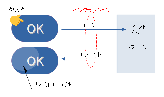
これを「インタラクション処理」といいます。
リップルエフェクト
クリックによるボタンの状態変化(Release>Press>Release)でリップルエフェクト(Ripple Effect)が表現され、薄いハイライトが広がります。クリック感をユーザへ示すための演出です。
Buttonのインタラクション処理はリップルエフェクトに固定化されています。
リップル(波紋)に変更(色を変えるなど)を加えたり、リップル自体を別のエフェクトへ置き換えたりできません。
ユーザエフェクト
InteractionSourceはユーザの操作によるUI要素の状態変化を観測し、非同期に報告してくれます。
次のような状態変化が観測可能です。
| 状態変化 | 関数(InterractionSourceの拡張関数) |
|---|---|
| Press | InteractionSource.collectIsPressedAsState() |
| Focus | InteractionSource.collectIsFocusedAsState() |
| Dragge | InteractionSource.collectIsDraggedAsState() |
| Hovere | InteractionSource.collectIsHoveredAsState() |
この報告に合わせたユーザ定義のエフェクトを追加できます。
例えば、Buttonの押下(Press)で文字色を赤に変えるエフェクトは、次のように記述できます。
            val interactionSource = remember { MutableInteractionSource() }

            val isPressed by interactionSource.collectIsPressedAsState()
            Button(
                onClick = { /* do something */ },
                interactionSource = interactionSource) {
                Text(
                    text = "OK",
                    color = if(isPressed) Color.Red else Color.White
                )
            }
変数isPressedはState<Boolean>型であり、UI要素の状態の追跡対象です。
isPressが非同期に変化すれば変化に応じてButtonが再コンポーズとなり、「isPress==true」で文字”OK”が赤(Color.Red)へ変化し、「isPress==false」で白(Color.White)へ変化します。
InteractionSourceによるUI要素の状態変化の観測と報告はFlowにより行われています。
※Flowについては「Coroutine:コルーチン間でメッセージの送受信」を参照
派生タイプ
Button関数をベースにした派生タイプが定義されています。
どれも、Button関数の引数の初期値を上書きし、装飾と演出を変更したものです。構成に手を加えたものではありません。
Button(ベース)
塗りつぶされたボタンです。色はマテリアルデザインのPrimaryColorが使用されます。
Buttonは派生タイプのベースになるUIです。この記事中に使用されているサンプルは、Button関数を使っています。
マテリアルデザインのButtonの「FilledButton」に相当します。
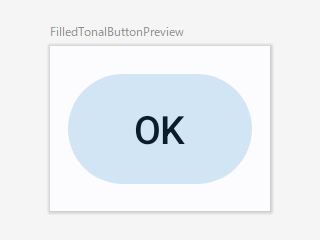
FilledTonalButton
塗りつぶされたボタンです。色はマテリアルデザインのSecondaryColorが使用されます。
@Composable
fun FilledTonalButton(
    onClick: () -> Unit,
    modifier: Modifier = Modifier,
    enabled: Boolean = true,
    shape: Shape = ButtonDefaults.filledTonalShape,
    colors: ButtonColors = ButtonDefaults.filledTonalButtonColors(),
    elevation: ButtonElevation? = ButtonDefaults.filledTonalButtonElevation(),
    border: BorderStroke? = null,
    contentPadding: PaddingValues = ButtonDefaults.ContentPadding,
    interactionSource: MutableInteractionSource = remember { MutableInteractionSource() },
    content: @Composable RowScope.() -> Unit
)
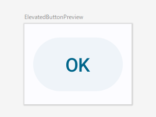
ElevatedButton
画面から突出しているような形状を演出したボタンです。デフォルトはあまり突出しているように見えませんが…
@Composable
fun ElevatedButton(
    onClick: () -> Unit,
    modifier: Modifier = Modifier,
    enabled: Boolean = true,
    shape: Shape = ButtonDefaults.elevatedShape,
    colors: ButtonColors = ButtonDefaults.elevatedButtonColors(),
    elevation: ButtonElevation? = ButtonDefaults.elevatedButtonElevation(),
    border: BorderStroke? = null,
    contentPadding: PaddingValues = ButtonDefaults.ContentPadding,
    interactionSource: MutableInteractionSource = remember { MutableInteractionSource() },
    content: @Composable RowScope.() -> Unit
)
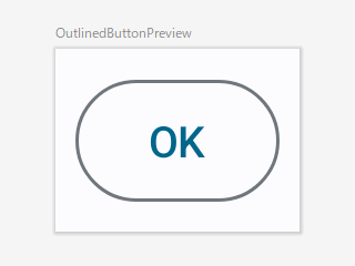
OutlinedButton
輪郭を持ったボタンです。
@Composable
fun OutlinedButton(
    onClick: () -> Unit,
    modifier: Modifier = Modifier,
    enabled: Boolean = true,
    shape: Shape = ButtonDefaults.outlinedShape,
    colors: ButtonColors = ButtonDefaults.outlinedButtonColors(),
    elevation: ButtonElevation? = null,
    border: BorderStroke? = ButtonDefaults.outlinedButtonBorder,
    contentPadding: PaddingValues = ButtonDefaults.ContentPadding,
    interactionSource: MutableInteractionSource = remember { MutableInteractionSource() },
    content: @Composable RowScope.() -> Unit
)
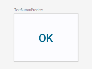
TextButton
テキストのみのボタンです。
@Composable
fun TextButton(
    onClick: () -> Unit,
    modifier: Modifier = Modifier,
    enabled: Boolean = true,
    shape: Shape = ButtonDefaults.textShape,
    colors: ButtonColors = ButtonDefaults.textButtonColors(),
    elevation: ButtonElevation? = null,
    border: BorderStroke? = null,
    contentPadding: PaddingValues = ButtonDefaults.TextButtonContentPadding,
    interactionSource: MutableInteractionSource = remember { MutableInteractionSource() },
    content: @Composable RowScope.() -> Unit
)
関連記事: