Jetpack composeは、アプリ開発に必要な一通りのUIコンポーネントをライブラリで提供しています。
そのライブラリ中のImageについて、構成や使用方法などをまとめます。
※環境:Android Studio Hedgehog | 2023.1.1 Patch 2
Kotlin 1.9.0
Compose Compiler 1.5.1
androidx.compose.foundation 1.5.0
目次
UIの概要
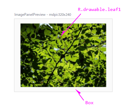
Imageは画像データの表示を行うUI要素です。
@Preview_mdpi
@Composable
fun ImagePanelPreview() {
    Box(
        modifier = Modifier.size(320.dp, 240.dp),
        contentAlignment = Alignment.Center
    ) {
        Image(
            painter = painterResource(R.drawable.leaf1),
            contentDescription = "新緑の季節",
        )
    }
}
関数の引数
Imageの状態(コンテンツ、装飾、演出など)は、引数により指定できます。
fun Image(
    painter: Painter,
    contentDescription: String?,
    modifier: Modifier = Modifier,
    alignment: Alignment = Alignment.Center,
    contentScale: ContentScale = ContentScale.Fit,
    alpha: Float = DefaultAlpha,
    colorFilter: ColorFilter? = null
) { ... }
| 引数 | 概要 | |
|---|---|---|
| painter | Painter | 画像データ |
| contentDescription | String? | 画像の説明 |
| modifier | Modifier | UI全般のCompose修飾子 |
| alignment | Aligment | 画像の配置(配置の基準点)(後述) |
| contentScale | ContentScale | 画像のスケールモード(後述) |
| alpha | Float | 画像のアルファ値 |
| colorFilter | colorFilter | 画素に適用するカラーフィルター(後述) |
関数の構成
関数は内部にLayout関数(Composable関数)のみを持ちます。
Layoutは「自身のサイズを決定する機能」を定義する関数です。この機能は描画処理のLayoutフェーズで実行されます。
また、画像データ(Painter)は拡張関数Modifier.paint( )へ渡されて、描画処理のDrawingフェーズで描画されます。
※描画処理については「Jetpack Compose:Composeによるアプリ画面の描画」を参照
@Composable
fun Image(
    painter: Painter,
    contentDescription: String?,
    modifier: Modifier = Modifier,
    alignment: Alignment = Alignment.Center,
    contentScale: ContentScale = ContentScale.Fit,
    alpha: Float = DefaultAlpha,
    colorFilter: ColorFilter? = null
) {
    val semantics = if (contentDescription != null) {
        Modifier.semantics {
            this.contentDescription = contentDescription
            this.role = Role.Image
        }
    } else {
        Modifier
    }

    // Explicitly use a simple Layout implementation here as Spacer squashes any non fixed
    // constraint with zero
    Layout(
        {},
        modifier.then(semantics).clipToBounds().paint(
            painter,
            alignment = alignment,
            contentScale = contentScale,
            alpha = alpha,
            colorFilter = colorFilter
        )
    ) { _, constraints ->
        layout(constraints.minWidth, constraints.minHeight) {}
    }
}
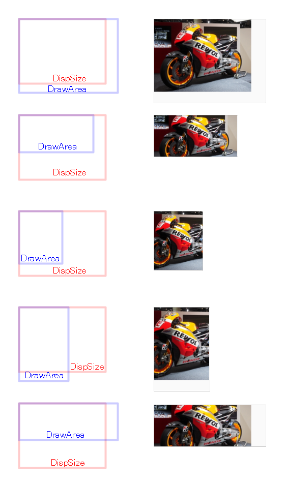
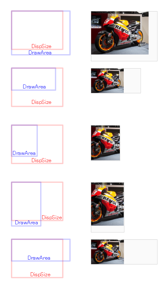
画像のサイズ(Modifier.size)
Modifier.sizeで画像の表示サイズ(DispSize)が指定できます。
表示サイズに合うように、画像(OriginSize)のスケーリング(DispSizeへ拡大・縮小)が行われます。
@Preview_mdpi
@Composable
fun SizeXXX() {
    Box(modifier = Modifier.size(320.dp, 240.dp)) {     // DrawArea:320x240
        Image(
            painter = painterResource(R.drawable.bike), // OriginSize:280x210
            contentDescription = null,
            modifier = Modifier.size(320.dp, 240.dp) // ZoomIn  DispSize:320x240
//          modifier = Modifier                      // 1on1    DispSize:280x210
//          modifier = Modifier.size(240.dp, 180.dp) // ZoomOut DispSize:240x180
        )
    }
}
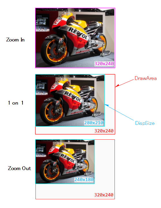
サンプル中に登場する「DrawArea」は「描画が可能な領域」を表しています。
ImageはBox(コンテナタイプのUI)へ格納されます。ですので、Imageが描画可能な領域はBoxのサイズ内です。
「DrawArea < DispSize」の場合は、スケールモード(contentScale)に従った縮小が行われるので注意してください。
ちなみに、DrawAreaのことを「制約(Constraints)」と呼びます。制約はBoxからImageへ与えられます。
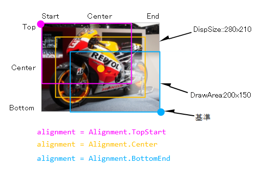
画像の配置(引数:alignment)
「引数:alignment」で画像の配置を指定できます。
| パラメータ | 基準点 | ||
|---|---|---|---|
| Alignment | TopStart | 垂直方向:上 | 水平方向:左 |
| TopCenter | 水平方向:中央 | ||
| TopEnd | 水平方向:右 | ||
| CenerStart | 垂直方向:中央 | ||
| Cener | |||
| CenterEnd | |||
| BottomStart | 垂直方向:下 | ||
| BottomCenter | |||
| BottomEnd | |||
パラメータは画像の一点を表しています。画像はこの点を基準に配置されます。
@Preview_mdpi
@Composable
fun AlignmentXXX() {
    Box(modifier = Modifier.size(200.dp, 150.dp)) {     // DrawArea:200x150
        Image(
            painter = painterResource(R.drawable.bike), // DispSize:280x210
            contentDescription = null,
            contentScale = ContentScale.None,			// スケーリング無し
            alignment = Alignment.TopStart
//            alignment = Alignment.TopCenter
//            alignment = Alignment.TopEnd
//            alignment = Alignment.CenterStart
//            alignment = Alignment.Center
//            alignment = Alignment.CenterEnd
//            alignment = Alignment.BottomStart
//            alignment = Alignment.BottomCenter
//            alignment = Alignment.BottomEnd
        )
    }
}
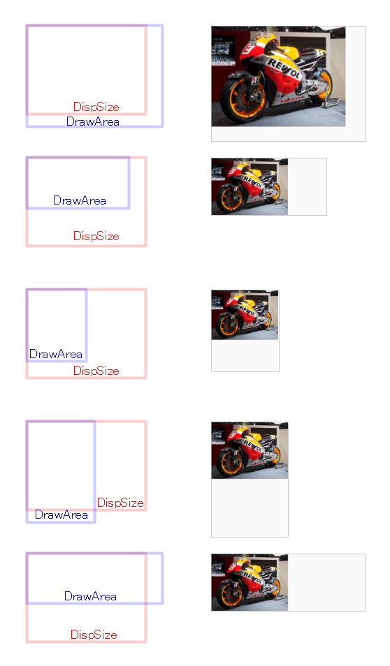
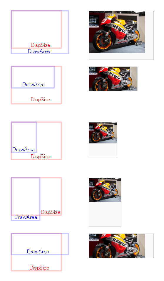
画像のスケールモード(引数:contentScale)
「引数:contentScale」で画像のスケールモードを指定できます。
| モード | スケーリング動作 | ||
|---|---|---|---|
| Crop | アスペクト比を維持 | 縦または横が DispSize≦DrawAreaになるまでスケーリング | 切り出し有り |
| Fit | DispSize全体が DrawAreaに収まるまでスケーリング | 切り出し無し | |
| FillHeight | 縦が DispSize≦DrawAreaになるまでスケーリング | 切り出し有り | |
| FillWidth | 横が DispSize≦DrawAreaになるまでスケーリング |
||
| Inside | Fitと同じ | ||
| None | スケーリング無し | ||
| FillBounds | アスペクト比を無視 | DispSize全体が DrawAreaに収まるまでスケーリング | 切り出し無し |
| ※デフォルト:「alignment = Alignment.Center」のため、画像の中心を基準に切り出し | |||
以下は、描画が可能な領域(DrawArea)と表示サイズ(DispSize)の組み合わせによる、スケーリング動作の違いを示した図です。
@Preview_mdpi
@Composable
fun ContentScaleTestPreview() {
    Box(modifier = Modifier.size(320.dp, 240.dp)) {     // DrawArea:320x240
//    Box(modifier = Modifier.size(240.dp, 120.dp)) {   // DrawArea:240x120
//    Box(modifier = Modifier.size(140.dp, 170.dp)) {   // DrawArea:140x170
//    Box(modifier = Modifier.size(160.dp, 240.dp)) {   // DrawArea:160x240
//    Box(modifier = Modifier.size(320.dp, 120.dp)) {   // DrawArea:320x120
        Image(
            painter = painterResource(R.drawable.bike), // DispSize:280x210
            contentDescription = null,
            contentScale = ContentScale.Crop
//            contentScale = ContentScale.Fit
//            contentScale = ContentScale.FillHeight
//            contentScale = ContentScale.FillWidth
//            contentScale = ContentScale.Inside
//            contentScale = ContentScale.None
//            contentScale = ContentScale.FillBounds
        )
    }
}

画素のカラーフィルター(引数:colorFilter)
「引数:colorFilter」で画像の画素(ピクセルのARGB値)に適用するカラーフィルターを指定できます。
タイプは3つあります。
| タイプ | フィルター動作 |
|---|---|
| tini | ソース画素とデスティネーション画素の色をBlendModeに従って合成 用途:アイコンの配色の置き換え |
| colorMatrix | 4x5カラーマトリックスを使った演算で色を変換 用途:彩度の変更、YUV⇔RGB変換 |
| lighting | 乗算値と加算値の2つを使った演算で色を変換 用途:照明効果のシミュレート |
※次の場所にドキュメント「画像のピクセルカラーを変換する」が用意されています。
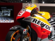
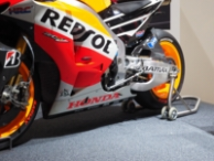
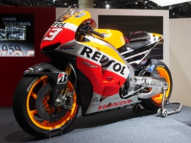
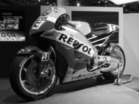
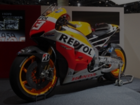
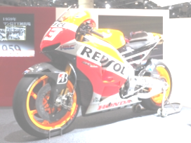
※サンプルに登場するオリジナル画像
tin
ソース画素(第1引数)とデスティネーション画素(オリジナル画像の画素)の色をBlendMode(第2引数)に従って合成します。
@Immutable
class ColorFilter internal constructor(internal val nativeColorFilter: NativeColorFilter) {
    companion object {
        ...
        @Stable
        fun tint(color: Color, blendMode: BlendMode = BlendMode.SrcIn): ColorFilter =
            actualTintColorFilter(color, blendMode)
        ...
    }
}
BlendModeについては「BlendMode(Compose UI向け説明)」または「BlendMode(画像付き)」を参照してください。
BlendMode.Overlayデスティネーション側を優先するように、ソースとデスティネーション画素の色を乗算します。
@Preview_mdpi
@Composable
fun FilterTint_Overlay() {
    Box {
        Image(
            painter = painterResource(R.drawable.bike),
            contentDescription = null,
//            colorFilter = ColorFilter.tint(Color.Red, BlendMode.Overlay)
//            colorFilter = ColorFilter.tint(Color.Green, BlendMode.Overlay)
            colorFilter = ColorFilter.tint(Color.Blue, BlendMode.Overlay)
        )
    }
}
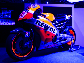
ソース画像を表示しますが、デスティネーション画像と重なる画素のみを表示します。
@Preview_mdpi
@Composable
fun FilterTint_SrcIn() {
Box {
Image(
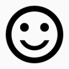
painter = painterResource(R.drawable.baseline_sentiment_satisfied),
contentDescription = null,
// colorFilter = ColorFilter.tint(Color.Cyan, BlendMode.SrcIn)
colorFilter = ColorFilter.tint(Color.Magenta, BlendMode.SrcIn)
)
}
}

アイコンの色を状況により動的に変更したい場合に有効です。
colorMatrix
4×5カラーマトリックスを使った演算で色を変換します。
マトリックスは配列(FloatArray)で表現されます。
@Immutable
class ColorFilter internal constructor(internal val nativeColorFilter: NativeColorFilter) {
    companion object {
        ...
        @Stable
        fun colorMatrix(colorMatrix: ColorMatrix): ColorFilter =
            actualColorMatrixColorFilter(colorMatrix)
        ...
    }
}
★「4x5カラーマトリックス」の配列表現

[ a, b, c, d, e,
  f, g, h, i, j,
  k, l, m, n, o,
  p, q, r, s, t ]

★「画素(R,G,B,A)×カラーマトリックス」の演算

R' = a*R + b*G + c*B + d*A + e;
G' = f*R + g*G + h*B + i*A + j;
B' = k*R + l*G + m*B + n*A + o;
A' = p*R + q*G + r*B + s*A + t;
ネガティブへ変換
ポジ⇒ネガ変換の例です。
R、G、B値を反転させています。
@Preview_mdpi
@Composable
fun FilterColorMatrix_Nega() {
    Box {
       val _matrix = ColorMatrix(floatArrayOf(
            -1.0f,  0.0f,  0.0f,  0.0f,  255.0f,
             0.0f, -1.0f,  0.0f,  0.0f,  255.0f,
             0.0f,  0.0f, -1.0f,  0.0f,  255.0f,
             0.0f,  0.0f,  0.0f,  1.0f,    0.0f
        ))
        Image(
            painter = painterResource(R.drawable.bike),
            contentDescription = null,
            colorFilter = ColorFilter.colorMatrix(_matrix)
        )
    }
}
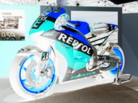
カラー⇒モノクロ変換の例です。
@Preview_mdpi
@Composable
fun FilterColorMatrix_Mono() {
    Box {
        val _matrix = ColorMatrix().apply { setToSaturation(0f) }
        Image(
            painter = painterResource(R.drawable.bike),
            contentDescription = null,
            colorFilter = ColorFilter.colorMatrix(_matrix)
        )
    }
}
定型のマトリックスが準備されています。その中のsetToSaturation( )を用いています。
lighting
乗算値(multiply)と加算値(add)の2つを使った演算で色を変換します。
乗算はmultiply/255(≦1)が係数になるので、暗くする効果があります。
また、加算はadd(≧0)が係数になるので、明るくする効果があります。
@Immutable
class ColorFilter internal constructor(internal val nativeColorFilter: NativeColorFilter) {
    companion object {
        ...
        @Stable
        fun lighting(multiply: Color, add: Color): ColorFilter =
            actualLightingColorFilter(multiply, add)
        ...
    }
}
★「multiplyとadd」の表現

multiply = Color(m_r, m_g, m_b, m_a)
add      = Color(a_r, a_g, a_b, a_a)

★「乗算と加算」の演算

R' = (m_r/255)*R + a_r;
G' = (m_g/255)*G + a_g;
B' = (m_b/255)*B + a_b;
A' = A;

※アルファ―値(m_a、a_a)は無視
Darkness(乗算)
輝度を1/2にする例です。
@Preview_mdpi
@Composable
fun FilterLighting_Mul() {
    Box(modifier = Modifier.background(Color.Cyan)) {
        val _multiply = Color(128, 128, 128, 255)
        val _add = Color(0, 0, 0, 255)
        Image(
            painter = painterResource(R.drawable.bike),
            contentDescription = null,
            colorFilter = ColorFilter.lighting(_multiply, _add)
        )
    }
}
輝度を×2にする例です。一部(右下)が白飛びになっています。
@Preview_mdpi
@Composable
fun FilterLighting_Add() {
    Box(modifier = Modifier.background(Color.Cyan)) {
        val _multiply = Color(255, 255, 255, 255)
        val _add = Color(128, 128, 128, 255)
        Image(
            painter = painterResource(R.drawable.bike),
            contentDescription = null,
            colorFilter = ColorFilter.lighting(_multiply, _add)
        )
    }
}
関連記事: