Jetpack composeは、アプリ開発に必要な一通りのUIコンポーネントをライブラリで提供しています。
そのライブラリ中のRadioButtonについて、構成や使用方法などをまとめます。
※環境:Android Studio Hedgehog | 2023.1.1
Kotlin 1.8.10
Compose Compiler 1.4.3
UIの概要
RadioButtonはラジオボタンのボタン部分を表現するUI要素です。
ラジオボタンは2つ以上の項目から一つを選択するボタンです。常に一つだけが選択された状態になる特徴があります。
現在と別のボタンを選択すれば、旧ボタンは解除され、新ボタンが選択された状態になります。
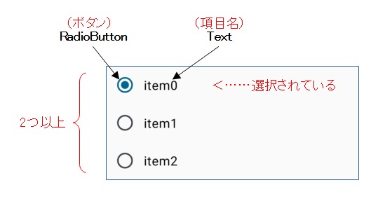
ラジオボタンとしての動作を実現するために、RadioButtonは「2つ以上のボタン」と「ボタン間のセレクト処理」の実装が必要です。
また、RadioButtonはボタン部分のみなので、項目名(アイコン、画像なども可能)を表示するなど、ユーザに対する説明の配慮も必要です。
関数の引数
RadioButtonの状態(コンテンツ、装飾、演出など)は、引数により指定できます。
@Composable
fun RadioButton(
    selected: Boolean,
    onClick: (() -> Unit)?,
    modifier: Modifier = Modifier,
    enabled: Boolean = true,
    colors: RadioButtonColors = RadioButtonDefaults.colors(),
    interactionSource: MutableInteractionSource = remember { MutableInteractionSource() }
) { ... }
| 引数 | 概要 | |
|---|---|---|
| selected | Boolean | ボタンの状態 true:選択/false:非選択 |
| onClick | ( )->Unit? | クリックで実行する関数オブジェクト(ラムダ式) |
| modifier | Modifier | UI全般のCompose修飾子 |
| enabled | Boolean | UIの有効:true/無効:false ※有効⇒クリック可能、無効⇒クリック不可 |
| colors | RadioButtonColors | 選択あり/なし(selected)、有効/無効(enabled)に合わせた色の情報 |
| interactionSource | MutableInteractionSource | ユーザが行ったUI操作の観測と報告 |
関数の構成
RadioButtonは下位階層にCanvas(Composable関数)を一つ持つ構成になっています。
このCanvasの引数onDrawに指定されるラムダ式で、ボタンの図形が描画(drawCircle)されています。
onDrawはViewシステム(前UIシステム)と同じ機能を有しますが、Canvasクラスのインスタンスが引数では無く、レシーバー(this)で与えられる点が異なります。
また、RadioButtonはボタンの状態(選択/非選択)を保持していません。入力された状態(引数selected)に合わせて、ボタンの形状と配色を変えているだけです。
選択されているボタンの管理はプログラマ側で実装します(後述、セレクト処理を参照)。
@Composable
fun RadioButton( ... ) {
    val dotRadius = animateDpAsState(
        targetValue = if (selected) RadioButtonDotSize / 2 else 0.dp,
        animationSpec = tween(durationMillis = RadioAnimationDuration)
    )
    val radioColor = colors.radioColor(enabled, selected)
    val selectableModifier =
        if (onClick != null) {
            Modifier.selectable(
                selected = selected,
                onClick = onClick,
                enabled = enabled,
                role = Role.RadioButton,
                interactionSource = interactionSource,
                indication = rememberRipple(
                    bounded = false,
                    radius = RadioButtonTokens.StateLayerSize / 2
                )
            )
        } else {
            Modifier
        }
    Canvas(
        modifier
            .then(
                if (onClick != null) {
                    Modifier.minimumInteractiveComponentSize()
                } else {
                    Modifier
                }
            )
            .then(selectableModifier)
            .wrapContentSize(Alignment.Center)
            .padding(RadioButtonPadding)
            .requiredSize(RadioButtonTokens.IconSize)
    ) {
        // Draw the radio button
        val strokeWidth = RadioStrokeWidth.toPx()
        drawCircle(
            radioColor.value,
            radius = (RadioButtonTokens.IconSize / 2).toPx() - strokeWidth / 2,
            style = Stroke(strokeWidth)
        )
        if (dotRadius.value > 0.dp) {
            drawCircle(radioColor.value, dotRadius.value.toPx() - strokeWidth / 2, style = Fill)
        }
    }
}
@Composable
fun Canvas(modifier: Modifier, onDraw: DrawScope.() -> Unit) =
    Spacer(modifier.drawBehind(onDraw))
セレクト処理
セレクト処理を実装しないと、ラジオボタンとして動作しません。
@Composable
fun RadioButtonPanel(labels: Array<String>) {
    val _current = remember { mutableStateOf(labels.first()) }
    Column {
        labels.forEach {  // itはforEachの要素、項目名
            Row(verticalAlignment = Alignment.CenterVertically) {
                RadioButton(
                    selected = _current.value == it,   // 排他的な処理(2)
                    onClick = { _current.value = it }  // 排他的な処理(1)
                )
                Text(text = it, modifier = Modifier.fillMaxWidth())
            }
        }
    }
}
セレクト処理は2つのステップから成り立ちます。
排他的な処理(1)ボタンのクリックで発生するイベントにより、onClick(ラムダ式)が実行されます。ここで、新しい状態を_currentへ保存します。これにり、関数RadioButtonPanelは再Composeの対象になります。
排他的な処理(2)関数RadioButtonPanelが再Composeされます。実行されるRadioButtonにおいて、新しい状態と自分を比較し、選択⇔非選択(selectedのfalse/true)を切り替えます。
    private val labels = arrayOf("item0", "item1", "item2")

    override fun onCreate(savedInstanceState: Bundle?) {
        super.onCreate(savedInstanceState)
        setContent {
            MyApplicationTheme {
                Surface(
                    modifier = Modifier.fillMaxSize(),
                    color = MaterialTheme.colorScheme.background
                ) {
                    RadioButtonPanel(labels = labels)
                }
            }
        }
    }
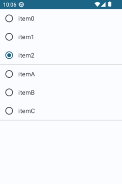
サンプル:設定を行うActivity
RadioButtonはユーザがアプリの設定を行うような場面で多用されます。
サンプルはアプリの設定を行うActivityです。
データクラスRadioButtonDatasetを介して、ロジックからUIへ項目名を渡し、逆にUIからロジックへ選択の結果を返しています。
@Stable
data class RadioButtonDataset(val labels: Array<String>) {
    var selectedValue: String? = null
}

@Composable
fun RadioButtonPanel(dataset: RadioButtonDataset) {
    val _current = remember { mutableStateOf(dataset.selectedValue) }
    Column {
        dataset.labels.forEach {  // itはforEachの要素
            Row(verticalAlignment = Alignment.CenterVertically) {
                RadioButton(
                    selected = _current.value == it, // 排他的な処理
                    onClick = {
                        _current.value = it          // 排他的な処理
                        dataset.selectedValue = it   // ロジックへ返す
                    }
                )
                Text(text = it, modifier = Modifier.fillMaxWidth())
            }
        }
    }
}
ちなみに、UIツリーの描画処理(再Composeなど)は「onResume終了~onPause開始」の区間に行われます。
サンプルは、描画処理の前後のタイミングを利用して、onStartでボタンの初期状態を設定し、onStopで取得した選択値を処理しています。
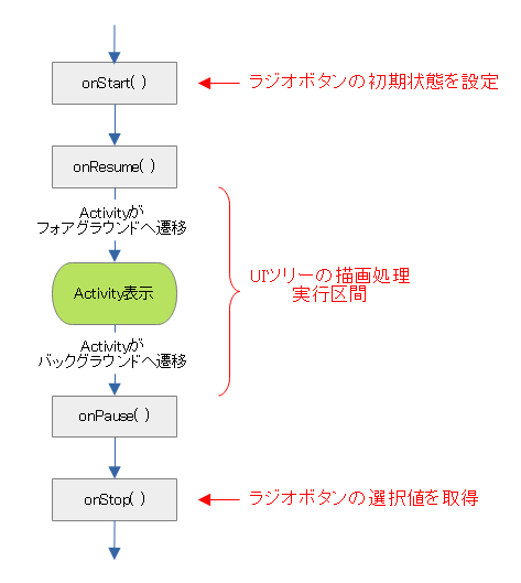
※描画処理については「Jetpack Compose:Composeによるアプリ画面の描画」を参照
class ConfigurationActivity : ComponentActivity() {

    private val rbn012 = RadioButtonDataset(arrayOf("item0", "item1", "item2"))
    private val rbnABC = RadioButtonDataset(arrayOf("itemA", "itemB", "itemC"))

    override fun onCreate(savedInstanceState: Bundle?) {
        super.onCreate(savedInstanceState)
        setContent {
            MyApplicationTheme {
                Surface(
                    modifier = Modifier.fillMaxSize(),
                    color = MaterialTheme.colorScheme.background
                ) {
                    // Configの画面を定義
                    Column {
                        RadioButtonPanel(dataset = rbn012)	// 動作設定1
                        Divider(color = Color.LightGray)
                        RadioButtonPanel(dataset = rbnABC)	// 動作設定2
                        Divider(color = Color.LightGray)
                    }
                }
            }
        }
    }

    override fun onStart() {
        super.onStart()
        // ラジオボタンの初期値を設定
        rbn012.selectedValue = rbn012.labels.last()
        // ※ABC側は初期値なし
    }

    /*
    ** onResumeの実行後、UIツリーの描画処理が開始される
    */

    override fun onStop() {
        super.onStop()
        // ラジオボタンの選択値を取得
        val _value012 = rbn012.selectedValue
        val _index012 = rbn012.labels.indexOf(_value012)
        val _valueABC = rbnABC.selectedValue
        val _indexABC = rbnABC.labels.indexOf(_valueABC)
        // 選択値に応じた処理
        // ~ここから~
        ...
        // ~ここまで~
    }
}
関連記事: