Jetpack composeは、アプリ開発に必要な一通りのUIコンポーネントをライブラリで提供しています。
そのライブラリ中のBottomAppBarについて、構成や使用方法などをまとめます。
※環境:Android Studio Koala | 2024.1.1
Kotlin 1.9.0
Compose Compiler 1.5.1
androidx.compose.material3:material3 1.1.1
UIの概要
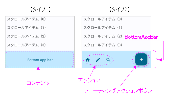
BottomAppBarはアプリ画面の下部に表示される帯状のUIです。
基本は、Scaffoldに組み込んで使用します。
※Scaffoldについては「Compose UI:Scaffold」を参照
BottomAppBarはマテリアルデザインの指標に準拠しています。
※詳細は「マテリアルデザイン:Bottom app bar」を参照してください。
    Scaffold(
        bottomBar = {
            BottomAppBar(
                containerColor = MaterialTheme.colorScheme.primaryContainer,
                contentColor = MaterialTheme.colorScheme.primary,
            ) {
                Text(
                    modifier = Modifier.fillMaxWidth(),
                    textAlign = TextAlign.Center,
                    text = "Bottom app bar",
                )
            }
        }
    ) { innerPadding ->
        Column(
            modifier = androidx.compose.ui.Modifier
                .padding(innerPadding)
                .verticalScroll(rememberScrollState()),
            verticalArrangement = Arrangement.spacedBy(16.dp),
        ) {
            for(i in 0..15) {
                Text(
                    modifier = Modifier.padding(start = 8.dp, end = 8.dp),
                    text = "スクロールアイテム(${i})"
                )
            }
        }
    }
    Scaffold(
        bottomBar = {
            BottomAppBar(
                actions = {
                    IconButton(onClick = { /* クリック時の処理 */ }) {
                        Icon(
                            imageVector = Icons.Filled.Home,
                            contentDescription = "Home"
                        )
                    }
                    IconButton(onClick = { /* クリック時の処理 */ }) {
                        Icon(
                            imageVector = Icons.Filled.Edit,
                            contentDescription = "Edit"
                        )
                    }
                    IconButton(onClick = { /* クリック時の処理 */ }) {
                        Icon(
                            imageVector = Icons.Filled.Search,
                            contentDescription = "Search"
                        )
                    }
                },
                floatingActionButton = {
                    FloatingActionButton(
                        onClick = { /* クリック時の処理 */ },
                        containerColor = MaterialTheme.colorScheme.primary,
                        contentColor = MaterialTheme.colorScheme.onPrimary
                    ) {
                        Icon(Icons.Default.Add, contentDescription = "Add")
                    }
                },
                containerColor = MaterialTheme.colorScheme.primaryContainer,
                contentColor = MaterialTheme.colorScheme.primary
            )
        }
    ) { innerPadding ->
        Column(
            modifier = androidx.compose.ui.Modifier
                .padding(innerPadding)
                .verticalScroll(rememberScrollState()),
            verticalArrangement = Arrangement.spacedBy(16.dp),
        ) {
            for(i in 0..15) {
                Text(
                    modifier = Modifier.padding(start = 8.dp, end = 8.dp),
                    text = "スクロールアイテム(${i})"
                )
            }
        }
    }
関数の引数
BottomAppBarの状態(装飾、演出など)は、引数により指定できます。
@Composable
fun BottomAppBar(
    modifier: Modifier = Modifier,
    containerColor: Color = BottomAppBarDefaults.containerColor,
    contentColor: Color = contentColorFor(containerColor),
    tonalElevation: Dp = BottomAppBarDefaults.ContainerElevation,
    contentPadding: PaddingValues = BottomAppBarDefaults.ContentPadding,
    windowInsets: WindowInsets = BottomAppBarDefaults.windowInsets,
    content: @Composable RowScope.() -> Unit
) { ... }
@Composable
fun BottomAppBar(
    actions: @Composable RowScope.() -> Unit,
    modifier: Modifier = Modifier,
    floatingActionButton: @Composable (() -> Unit)? = null,
    containerColor: Color = BottomAppBarDefaults.containerColor,
    contentColor: Color = contentColorFor(containerColor),
    tonalElevation: Dp = BottomAppBarDefaults.ContainerElevation,
    contentPadding: PaddingValues = BottomAppBarDefaults.ContentPadding,
    windowInsets: WindowInsets = BottomAppBarDefaults.windowInsets,
) = BottomAppBar(
    modifier = modifier,
    containerColor = containerColor,
    contentColor = contentColor,
    tonalElevation = tonalElevation,
    windowInsets = windowInsets,
    contentPadding = contentPadding
) { ... }
| 引数 | 概要 | |
|---|---|---|
| modifier | Modifier | UI全般のCompose修飾子 |
| containerColor | Color | コンテナ(バー背景)の色 |
| contentColor | Color | コンテンツの色 |
| tonalElevation | Dp | 重ね合わせる半透明色の色合い |
| contentPadding | PaddingValues | コンテンツ周りの余白 |
| windowInsets | WindowInsets | インセット(はめ込み位置) |
| content (タイプ1) | @Composable RowScope.() -> Unit | コンテンツのスロット |
| actions (タイプ2) | @Composable RowScope.() -> Unit | アクションのスロット |
| floatingActionButton (タイプ2) | @Composable (() -> Unit)? | フローティングボタンのスロット |
関数の構成
BottomAppBarはSurfaceとRowを重ね合わせた構成になっています。
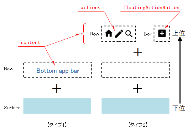
content(バーに表示する文字・アイコン)はRowに入るので、左寄り横並びの配置になります。
@Composable
fun BottomAppBar(
    ...
    content: @Composable RowScope.() -> Unit
) {
    Surface(
        color = containerColor,
        contentColor = contentColor,
        tonalElevation = tonalElevation,
        shape = BottomAppBarTokens.ContainerShape.toShape(),
        modifier = modifier
    ) {
        Row(
            Modifier
                .fillMaxWidth()
                .windowInsetsPadding(windowInsets)
                .height(BottomAppBarTokens.ContainerHeight)
                .padding(contentPadding),
            horizontalArrangement = Arrangement.Start,
            verticalAlignment = Alignment.CenterVertically,
            content = content
        )
    }
}
タイプ2はタイプ1の派生です。
タイプ1のcontentに、actionsとfloatingActionButtonスロットを新たに設けています。
@Composable
fun BottomAppBar(	// タイプ2
    actions: @Composable RowScope.() -> Unit,
    ... ,
    floatingActionButton: @Composable (() -> Unit)? = null,
    ...
) = BottomAppBar(	// タイプ1
    ...
) {					// タイプ1のcontentスロット
    actions()
    if (floatingActionButton != null) {
        Spacer(Modifier.weight(1f, true))
        Box(
            Modifier
                .fillMaxHeight()
                .padding(
                    top = FABVerticalPadding,
                    end = FABHorizontalPadding
                ),
            contentAlignment = Alignment.TopStart
        ) {
            floatingActionButton()
        }
    }
}
actionsスロットはRowなので、左寄り横並びの配置になります。また、floatingActionButtonスロットはBoxに入り、右寄りの配置(Spacerの効果)になります。
半透明色でオーバーレイ
コンテナ色がsurfaceの時、tonalElevationに連動したcontentColorの半透明色でバーが覆われます。
    Scaffold(
        bottomBar = {
            BottomAppBar(
                containerColor = MaterialTheme.colorScheme.surface,
                tonalElevation = 10.dp,
                contentColor = MaterialTheme.colorScheme.primary,
            ) {
                Text(
                    modifier = Modifier.fillMaxWidth(),
                    textAlign = TextAlign.Center,
                    text = "Bottom app bar",
                )
            }
        }
    ) { innerPadding -> ... }
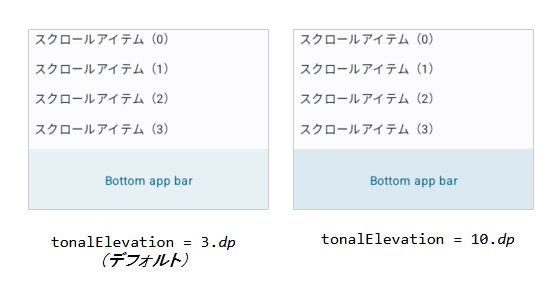
この機能が、どのような場面で利用されるのか、不明です。利用価値はあるのでしょうか?!
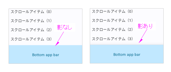
影付きのバー
Viewシステムのアプリケーションバーは影が付いていました。しかし、Jetpack composeにおけるマテリアルデザインのアプリケーションバーは影が付きません。
必要であれば、Modifier修飾子を使って影を付けることが可能です。
            BottomAppBar(
                modifier = Modifier.shadow(elevation = 10.dp),
                containerColor = MaterialTheme.colorScheme.primaryContainer,
                contentColor = MaterialTheme.colorScheme.primary,
            ) { ... }
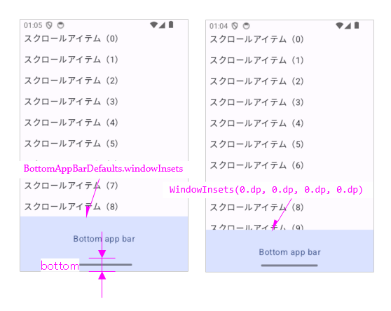
インセットの働き
インセットはナビゲーションバーとアプリケーションバーの重なりを避ける働きをします。
    override fun onCreate(savedInstanceState: Bundle?) {
        super.onCreate(savedInstanceState)
        enableEdgeToEdge()
        setContent {
            AppTheme {
                Scaffold(
                    modifier = Modifier.fillMaxSize(),
                    bottomBar = {
                        BottomAppBar(
                            containerColor = MaterialTheme.colorScheme.primaryContainer,
                            contentColor = MaterialTheme.colorScheme.primary,
    //                        windowInsets = BottomAppBarDefaults.windowInsets // デフォルト
                            windowInsets = WindowInsets(0.dp, 0.dp, 0.dp, 0.dp)
                        ) {
                            Text(
                                modifier = Modifier.fillMaxWidth(),
                                textAlign = TextAlign.Center,
                                text = "Bottom app bar",
                            )
                        }
                    }
                ) { innerPadding -> ... }
            }
        }
    }
関連記事: