Android SDKは様々なViewコンポーネント(TextView, Button, ImageViewなど)を含んでいます。
これだけで、十分に見栄えのあるアプリが開発できます。
ですが、全ての人やアプリの要望に対応することは難しく、アプリ開発中に「こんなViewが欲しい!」と思える場面があります。
そのような場合はカスタムビューの作成を検討してみましょう。「なければ作ってしまえ!」という訳です。
ここでは、「カスタムビューの動的な配置」をまとめます。
※環境:Android Studio Flamingo | 2022.2.1
動的な配置とは
「動的な配置」とは、プログラム中でViewをインスタンス化し、ViewGroup(コンテナタイプのView)へaddViewメソッドにより配置することです。
<?xml version="1.0" encoding="utf-8"?>
<androidx.constraintlayout.widget.ConstraintLayout
    ...
    tools:context=".DynamicViewActivity">

    <FrameLayout
        android:id="@+id/container"
        android:layout_width="100dp"
        android:layout_height="100dp"
        app:layout_constraintBottom_toBottomOf="parent"
        app:layout_constraintEnd_toEndOf="parent"
        app:layout_constraintStart_toStartOf="parent"
        app:layout_constraintTop_toTopOf="parent">

    </FrameLayout>

</androidx.constraintlayout.widget.ConstraintLayout>
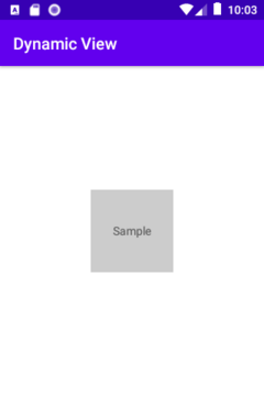
class DynamicViewActivity : AppCompatActivity() {
    override fun onCreate(savedInstanceState: Bundle?) {
        super.onCreate(savedInstanceState)
        setContentView(R.layout.activity_dynamic_view)

        val _container = findViewById<FrameLayout>(R.id.container)
        val _txtView = AppCompatTextView(this).apply {	// インスタンス化
            background = ColorDrawable(Color.LTGRAY)
            text = "Sample"
            gravity = Gravity.CENTER
        }
        _container.addView(								// Viewの配置
            _txtView,
            FrameLayout.LayoutParams.MATCH_PARENT,
            FrameLayout.LayoutParams.MATCH_PARENT
        )
    }
}
逆に「静的な配置」とは、レイアウトファイル中にViewの配置を記述して、レイアウトファイルを丸ごとインスタンス化することです。
インスタンス化
カスタムビューも動的な配置が可能です。
動的な配置を行うには、プログラム中でカスタムビューのインスタンス化が必要です。
インスタンス化の際にコンストラクタが呼ばれます。
コンストラクタ
カスタムビューを以下のように実装していれば、利用可能なコンストラクタは4つです。
class CustomView @JvmOverloads constructor(
    context: Context,
    attrs: AttributeSet? = null,
    defStyleAttr: Int = 0,
    defStyleRes: Int = 0
) : View(context, attrs, defStyleAttr, defStyleRes) {

    private var prm1: String?
    private var prm2: Int

    init {
        context.obtainStyledAttributes(                            // 属性の取得
            attrs, R.styleable.CustomView, defStyleAttr, defStyleRes)
            .apply {
                try {
                    prm1 = getString(R.styleable.CustomView_prm1)  // 属性の参照
                    prm2 = getInt(R.styleable.CustomView_prm2, -1) // 属性の参照
                }
                finally {
                    recycle()   // 最後にTypedArrayインスタンスを開放
                }
            }
    }

    ...
}
Viewのドキュメントはコンストラクタの用途を次のように説明しています。
【1】View(Context context)
Simple constructor to use when creating a view from code.
コードからビューを作成するときに使用する単純なコンストラクター。

【2】View(Context context, AttributeSet attrs)
Constructor that is called when inflating a view from XML.
XML からビューをインフレートするときに呼び出されるコンストラクター。

【3】View(Context context, AttributeSet attrs, int defStyleAttr)
Perform inflation from XML and apply a class-specific base style from a theme attribute.
XML からインフレーションを実行し、テーマ属性からクラス固有の基本スタイルを適用します。

【4】View(Context context, AttributeSet attrs, int defStyleAttr, int defStyleRes)
Perform inflation from XML and apply a class-specific base style from a theme attribute or style resource.
XML からインフレーションを実行し、テーマ属性またはスタイル リソースからクラス固有の基本スタイルを適用します。
引数の意味と使い方を見ていきます。
attrs
図は属性を取得するContext#obtainStyledAttributes( )の動作を示したものです。
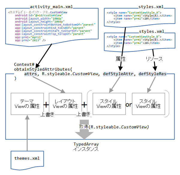
attrsは対象のViewの属性が入ります。これは、LayoutInflater#inflate( )メソッドがレイアウトファイルをインスタンス化する時に抽出したものです。
つまり、attrsは「静的な配置」を行う場合に使われます。
「動的な配置」でattrsは使用しません。常にattrs=null(または無)にします。
        CustomView(this@MainActivity)
        CustomView(this@MainActivity, null)
defStyleAttr
defStyleAttrはstyleリソースの指定された属性が入ります。
<?xml version="1.0" encoding="utf-8"?>
<resources>
    <attr name="defStyleAttr" format="reference" />
    <declare-styleable name="CustomView">
        <attr name="prm1" />
        <attr name="prm2" />
    </declare-styleable>
</resources>
<?xml version="1.0" encoding="utf-8"?>
<resources>
    <style name="CustomViewStyle_A" parent="">
        <item name="prm1">Prm1 is in Style(A).</item>
        <item name="prm2">20</item>
    </style>
</resources>
属性の指定はテーマファイル(theme.xml)で行います。
<resources xmlns:tools="http://schemas.android.com/tools">
    <!-- Base application theme. -->
    <style name="Theme.LibCustomView" parent="Theme.MaterialComponents.DayNight.DarkActionBar">
        <!-- Primary brand color. -->
        <item name="colorPrimary">@color/purple_500</item>
        <item name="colorPrimaryVariant">@color/purple_700</item>
        <item name="colorOnPrimary">@color/white</item>
        <!-- Secondary brand color. -->
        <item name="colorSecondary">@color/teal_200</item>
        <item name="colorSecondaryVariant">@color/teal_700</item>
        <item name="colorOnSecondary">@color/black</item>
        <!-- Status bar color. -->
        <item name="android:statusBarColor">?attr/colorPrimaryVariant</item>
        <!-- Customize your theme here. -->
        <item name="defStyleAttr">@style/CustomViewStyle_A</item>
    </style>
</resources>
CustomView(this@MainActivity, null, R.attr.defStyleAttr)
defStyleRes
defStyleResはstyleリソースがそのまま入ります。
<?xml version="1.0" encoding="utf-8"?>
<resources>
    <style name="CustomViewStyle_B" parent="">
        <item name="prm1">Prm1 is in Style(B).</item>
        <item name="prm2">20</item>
    </style>
</resources>
CustomView(this@MainActivity, null, 0, R.style.CustomViewStyle_B)
defStyleResを有効にするたに、「defStyleAttr ← 0(無効化)」にする必要があります。
採用されるビューの属性
表はView(カスタムビュー)のインスタンス化を行ったときに、採用される属性の所在を示しています。
コンストラクタの選択と引数の与え方により、採用される属性は異なるので、注意が必要です。
| コンストラクタ | attrs | defStyleAttr | defStyleRes | 採用される属性 |
|---|---|---|---|---|
| View(context) | themeに指定した属性 | |||
| View(context, attrs ) | ||||
| View(context, attrs, defStyleAttr ) | ||||
| CustomViewStyle_A | CustomViewStyle_A | |||
| View(context, attrs, defStyleAttr, defStyleRes ) | themeに指定した属性 | |||
| CustomViewStyle_B | CustomViewStyle_B | |||
| CustomViewStyle_A | CustomViewStyle_A | |||
| CustomViewStyle_A | CustomViewStyle_B |
defStyleAttrとdefStyleResは片方しか採用されません。引数へ両方を指定した場合は、defStyleAttrが選ばれます。
関連記事: