Jetpack composeは、アプリ開発に必要な一通りのUIコンポーネントをライブラリで提供しています。
そのライブラリ中のFloatingActionButtonについて、構成や使用方法などをまとめます。
※環境:Android Studio Koala | 2024.1.1
Kotlin 1.9.0
Compose Compiler 1.5.1
androidx.compose.material3:material3 1.1.1
目次
UIの概要
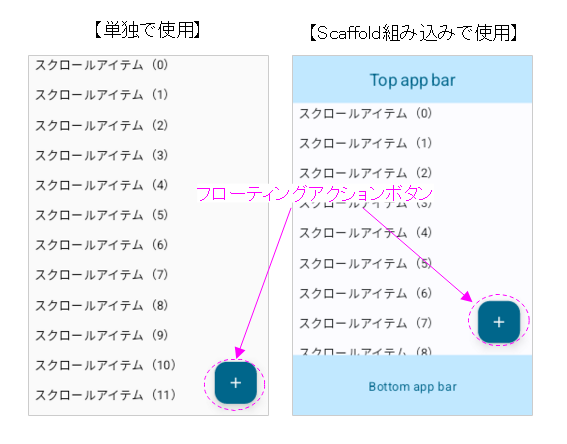
FloatingActionButton(以下Fabと表現)はアプリ画面の最上位レイヤーに表示され、常に定位置に存在するボタンです。
アプリ画面の上に浮いて見えるため、「フローティング」と呼ばれます。
ボタン押下時の動作は、アプリ画面で最も重要な(頻度の多い)動作に割り当てます。
Scaffoldに組み込んで使用すると、アプリバーを避けて配置してくれるので便利です。
Fabはマテリアルデザインの指標に準拠しています。
Material2までは円形でしたが、Material3からは角の丸い矩形になりました。
詳細は「マテリアルデザイン:Floating action buttons」を参照してください。
関数の引数
Fabの状態(装飾、演出など)は、引数により指定できます。
@Composable
fun FloatingActionButton(
    onClick: () -> Unit,
    modifier: Modifier = Modifier,
    shape: Shape = FloatingActionButtonDefaults.shape,
    containerColor: Color = FloatingActionButtonDefaults.containerColor,
    contentColor: Color = contentColorFor(containerColor),
    elevation: FloatingActionButtonElevation = FloatingActionButtonDefaults.elevation(),
    interactionSource: MutableInteractionSource = remember { MutableInteractionSource() },
    content: @Composable () -> Unit,
) { ... }
| 引数 | 概要 | |
|---|---|---|
| onClick, | () -> Unit | クリックで実行する関数オブジェクト (ラムダ式) |
| modifier | Modifier | UI全般のCompose修飾子 |
| shape | Shape | 角の形状 |
| containerColor | Color | コンテナ(ボタン背景)の色 |
| contentColor | Color | コンテンツの色 |
| elevation | FloatingActionButtonElevation | ボタンの高さ(影の広がりが変化) |
| interactionSource | MutableInteractionSource | ユーザが行ったUI操作の観測と報告 |
| content | @Composable () -> Unit | コンテンツのスロット |
関数の構成
FabはSurfaceとBoxを重ね合わせた構成になっています。
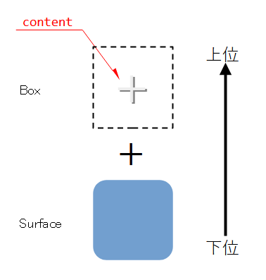
Boxに格納されるcontentは中心に配置されます。
@Composable
fun FloatingActionButton(
    ...
    content: @Composable () -> Unit,
) {
    Surface(
        ...
    ) {
        CompositionLocalProvider(LocalContentColor provides contentColor) {
            ProvideTextStyle(
                MaterialTheme.typography.fromToken(ExtendedFabPrimaryTokens.LabelTextFont),
            ) {
                Box(
                    modifier = Modifier
                        .defaultMinSize(
                            minWidth = FabPrimaryTokens.ContainerWidth,
                            minHeight = FabPrimaryTokens.ContainerHeight,
                        ),
                    contentAlignment = Alignment.Center,
                ) { content() }
            }
        }
    }
}
派生タイプ
FloatingActionButton関数をベースにした派生タイプが定義されています。
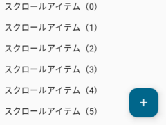
SmallFloatingActionButton
サイズが小さいFabです。
@Composable
fun FabPanel() {
    Box(modifier = Modifier.fillMaxSize()) {
        Column(
            verticalArrangement = Arrangement.spacedBy(16.dp)
        ) {
            for(i in 0..15) {
                Text(
                    modifier = Modifier.padding(start = 8.dp, end = 8.dp),
                    text = "スクロールアイテム(${i})"
                )
            }
        }
        SmallFloatingActionButton(
//        FloatingActionButton(
//        LargeFloatingActionButton(
            onClick = { /* クリック時の処理 */ },
            modifier = Modifier
                .align(alignment = Alignment.BottomEnd)
                .padding(15.dp),
            containerColor = MaterialTheme.colorScheme.primary,
            contentColor = MaterialTheme.colorScheme.onPrimary
        ) {
            Icon(Icons.Default.Add, contentDescription = "Add")
        }
    }
}
FloatingActionButton(ベース)
サイズがデフォルトのFabです。
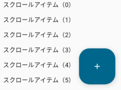
LargeFloatingActionButton
サイズが大きいFabです。
ExtendedFloatingActionButton
コンテンツの幅に合わせて、サイズが拡張するFabです。
@Composable
fun FabPanel() {
    Box(modifier = Modifier.fillMaxSize()) {
        Column(
            verticalArrangement = Arrangement.spacedBy(16.dp)
        ) {
            for(i in 0..15) {
                Text(
                    modifier = Modifier.padding(start = 8.dp, end = 8.dp),
                    text = "スクロールアイテム(${i})"
                )
            }
        }
        ExtendedFloatingActionButton(
            onClick = { /* クリック時の処理 */ },
            modifier = Modifier
                .align(alignment = Alignment.BottomEnd)
                .padding(15.dp),
            containerColor = MaterialTheme.colorScheme.primary,
            contentColor = MaterialTheme.colorScheme.onPrimary
        ) {
            Icon(Icons.Default.Favorite, contentDescription = "Favorite")
            Spacer(modifier = Modifier.size(10.dp))
            Text(text = "Favorite")
//            Icon(Icons.Default.Edit, contentDescription = "Edit")
//            Spacer(modifier = Modifier.size(10.dp))
//            Text(text = "Edit")
        }
    }
}
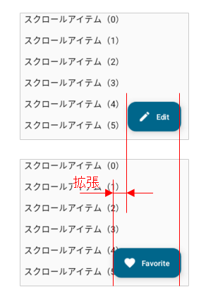
※フラグに応じて幅が伸縮するExtendedFloatingActionButtonは後述
伸縮するFloattingActionButton
ExtendedFloatingActionButtonは拡張するタイプの他に、伸縮するタイプがあります。
コンテンツは「Text + Icon」の固定になりますが、フラグ(引数:expanded)により伸縮する機能が付加されています。
@Composable
fun ExtendedFloatingActionButton(
    onClick: () -> Unit,
    modifier: Modifier = Modifier,
    shape: Shape = FloatingActionButtonDefaults.extendedFabShape,
    containerColor: Color = FloatingActionButtonDefaults.containerColor,
    contentColor: Color = contentColorFor(containerColor),
    elevation: FloatingActionButtonElevation = FloatingActionButtonDefaults.elevation(),
    interactionSource: MutableInteractionSource = remember { MutableInteractionSource() },
    content: @Composable RowScope.() -> Unit,
) { ... }
@Composable
fun ExtendedFloatingActionButton(
    text: @Composable () -> Unit,
    icon: @Composable () -> Unit,
    onClick: () -> Unit,
    modifier: Modifier = Modifier,
    expanded: Boolean = true,
    shape: Shape = FloatingActionButtonDefaults.extendedFabShape,
    containerColor: Color = FloatingActionButtonDefaults.containerColor,
    contentColor: Color = contentColorFor(containerColor),
    elevation: FloatingActionButtonElevation = FloatingActionButtonDefaults.elevation(),
    interactionSource: MutableInteractionSource = remember { MutableInteractionSource() },
) { ... }
この機能を使うと、「リストのスクロール中はFabを折り畳み、先頭・末尾にきたら展開」といったような、動きのあるFabが実装できます。
    Box(modifier = Modifier.fillMaxSize()) {
        val _scrollState = rememberScrollState()
        Column(
            modifier = Modifier.verticalScroll(_scrollState),
            verticalArrangement = Arrangement.spacedBy(16.dp)
        ) {
            for(i in 0..15) {
                Text(
                    modifier = Modifier.padding(start = 8.dp, end = 8.dp),
                    text = "スクロールアイテム(${i})"
                )
            }
        }
        val _listTop = _scrollState.value == 0
        val _listBottom = _scrollState.value == _scrollState.maxValue
        ExtendedFloatingActionButton(
            text = { Text(text = "Location") },
            icon = { Icon(Icons.Default.Place, contentDescription = "Location")},
            onClick = { /* クリック時の処理 */ },
            modifier = Modifier
                .align(alignment = Alignment.BottomEnd)
                .padding(15.dp),
            expanded = _listTop or _listBottom,
            containerColor = MaterialTheme.colorScheme.primary,
            contentColor = MaterialTheme.colorScheme.onPrimary
        )
    }
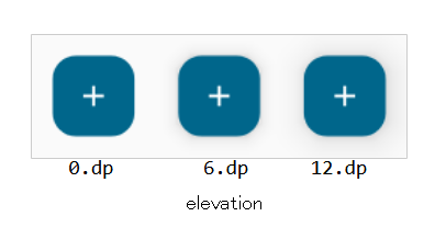
elevationの働き
コンテナの色(containerColor)により、2通りの動作をします。
containerColor≒ColorScheme.surfaceの時
影の広がりが変わります。
@Composable
fun ElevationFabPanel() {
    Row {
        FloatingActionButton(
            onClick = { /* クリック時の処理 */ },
            modifier = Modifier.padding(15.dp),
            containerColor = MaterialTheme.colorScheme.primary,
            contentColor = MaterialTheme.colorScheme.onPrimary,
            elevation = FloatingActionButtonDefaults.elevation(
//                defaultElevation = 0.dp
				defaultElevation = 6.dp		// デフォルト
//                defaultElevation = 12.dp
            )
        ) { Icon(Icons.Default.Add, contentDescription = "Add") }
    }
}
containerColor=ColorScheme.surfaceの時
ColorScheme.surfaceに半透明なColorScheme.surfaceTintを重ね合わせた色になります。
その半透明の割合がelevationです。
@Composable
fun ElevationFabPanel() {
    Row {
        FloatingActionButton(
            onClick = { /* クリック時の処理 */ },
            modifier = Modifier.padding(15.dp),
            containerColor = MaterialTheme.colorScheme.surface,
            contentColor = MaterialTheme.colorScheme.onSurface,
            elevation = FloatingActionButtonDefaults.elevation(
//                defaultElevation = 0.dp
				defaultElevation = 6.dp		// デフォルト
//                defaultElevation = 12.dp
            )
        ) { Icon(Icons.Default.Add, contentDescription = "Add") }
    }
}
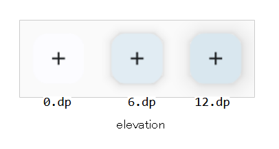
これはSurface(Compose UI)が持つ機能です。
@Composable
private fun surfaceColorAtElevation(color: Color, elevation: Dp): Color {
    return if (color == MaterialTheme.colorScheme.surface) {
        MaterialTheme.colorScheme.surfaceColorAtElevation(elevation)
    } else {
        color
    }
}
fun ColorScheme.surfaceColorAtElevation(
    elevation: Dp,
): Color {
    if (elevation == 0.dp) return surface
    val alpha = ((4.5f * ln(elevation.value + 1)) + 2f) / 100f
    return surfaceTint.copy(alpha = alpha).compositeOver(surface)
}
この機能が、どのような場面で利用されるのか、不明です。利用価値はあるのでしょうか?!
関連記事: