Jetpack composeは、アプリ開発に必要な一通りのUIコンポーネントをライブラリで提供しています。
そのライブラリ中のSnackbarについて、構成や使用方法などをまとめます。
※環境:Android Studio Koala | 2024.1.1
Kotlin 1.9.0
Compose Compiler 1.5.1
androidx.compose.material3:material3 1.1.1
UIの概要
Snackbarは、ユーザによる操作の応答や、その時点のアプリの状態を、バー状のポップアップウィンドウで通知するUIです。
Scaffoldに組み込んで使用すると、アプリバーを避けて配置してくれるので便利です。もちろん、単体でも使用できます。
Snackbarはマテリアルデザインの指標に準拠しています。
※詳細は「マテリアルデザイン:Snackbar」を参照してください。
UIの実装
Snackbarを実装するには、4つの要素が必要です。
- (1)スナックバーの状態と起動ポイントを作成(SnackbarHostState)
- (2)スナックバーの配置を制御(SnackbarHost)
- (3)スナックバーの本体を定義(Snackbar)
- (4)スナックバーの起動(表示)
    Box(modifier = Modifier.fillMaxSize()) {
        val _scope = rememberCoroutineScope()
        val _hostState = remember { SnackbarHostState() }
			         // ↑↑ (1)状態と起動ポイントを作成 ↑↑
        Text(
            modifier = Modifier.padding(8.dp),
            text = "${DummyStr('#', 600)}"   // ダミー:'#'が600文字
        )
        Button(
            onClick = {
                _scope.launch {    // ↓↓ (4)起動(表示)↓↓
                    _hostState.showSnackbar(message = "Snackbar !")
                }
            },
            modifier = Modifier
                .align(alignment = Alignment.TopEnd)
                .padding(10.dp)
        ) { Text(text = "Push") }

        SnackbarHost(              // (2)配置を制御
            hostState = _hostState,
            modifier = Modifier.align(Alignment.BottomCenter)
        ){
            Snackbar(              // (3)本体を定義(タイプ1)
                snackbarData = it,
                containerColor = MaterialTheme.colorScheme.errorContainer,
                contentColor = MaterialTheme.colorScheme.onErrorContainer
            )
        }
    }
    var presses by remember { mutableIntStateOf(0) }

    val scope = rememberCoroutineScope()
    val snackbarHostState = remember { SnackbarHostState() }
                        // ↑↑ (1)状態と起動ポイントを作成 ↑↑
    @OptIn(ExperimentalMaterial3Api::class)
    Scaffold(
        modifier = Modifier.fillMaxSize(),
        topBar = { ... },
        bottomBar = { ... },
        floatingActionButton = {
            FloatingActionButton(
                onClick = {
                    presses++
                    scope.launch {    // ↓↓ (4)起動(表示)↓↓
                        snackbarHostState.showSnackbar("Snackbar")
                    }
                },
                ...
            ) { ... }
        },
        snackbarHost = {
            SnackbarHost(hostState = snackbarHostState) {  // (2)配置を制御
                Snackbar(                                  // (3)本体を定義(タイプ1)
                    snackbarData = it,
                    containerColor = MaterialTheme.colorScheme.errorContainer,
                    contentColor = MaterialTheme.colorScheme.onErrorContainer
                )
            }
        }
    ) { innerPadding ->
        Column( ... ) {
            Text(
                modifier = Modifier.padding(8.dp),
                text =
                """
                    You have pressed the button $presses times.

                    ${DummyStr('#', 500)}   // ダミー:'#'が500文字
                """.trimIndent(),
            )
        }
    }
また、SnackbarHostStateインスタン内に起動ポイント(showSnackbar関数)が作成されます。
(2)スナックバーの配置を制御(SnackbarHost) SnackbarHostの表示を指定した位置に、バーは配置されます。 (3)スナックバーの本体を定義(Snackbar) スナックバーの本体のレイアウトを定義します。 (4)スナックバーの起動(表示) 起動ポイント(showSnackbar関数)を実行することで、スナックバーは表示されます。起動ポイントの実行はコルーチンを用いた非同期で行います。そのため、起動ポイントはSuspend関数です。
関数の引数
Snackbarの状態(装飾、演出など)は、引数により指定できます。
SnackbarHost
@Composable
fun SnackbarHost(
    hostState: SnackbarHostState,
    modifier: Modifier = Modifier,
    snackbar: @Composable (SnackbarData) -> Unit = { Snackbar(it) }
) { ... }
| 引数 | 概要 | |
|---|---|---|
| hostState | SnackbarHostState | HostStateのインスタンス |
| modifier | Modifier | UI全般のCompose修飾子 |
| snackbar | @Composable (SnackbarData) -> Unit | スナックバーのスロット デフォルト:Snackbar(it)(タイプ1) ※itはSnackbarDataのインスタンス |
Snackbar
タイプ1とタイプ2があります。※詳細は後述の「カスタムSnackbar」を参照
@Composable
fun Snackbar(
    snackbarData: SnackbarData,
    modifier: Modifier = Modifier,
    actionOnNewLine: Boolean = false,
    shape: Shape = SnackbarDefaults.shape,
    containerColor: Color = SnackbarDefaults.color,
    contentColor: Color = SnackbarDefaults.contentColor,
    actionColor: Color = SnackbarDefaults.actionColor,
    actionContentColor: Color = SnackbarDefaults.actionContentColor,
    dismissActionContentColor: Color = SnackbarDefaults.dismissActionContentColor,
) { ... }
@Composable
fun Snackbar(
    modifier: Modifier = Modifier,
    action: @Composable (() -> Unit)? = null,
    dismissAction: @Composable (() -> Unit)? = null,
    actionOnNewLine: Boolean = false,
    shape: Shape = SnackbarDefaults.shape,
    containerColor: Color = SnackbarDefaults.color,
    contentColor: Color = SnackbarDefaults.contentColor,
    actionContentColor: Color = SnackbarDefaults.actionContentColor,
    dismissActionContentColor: Color = SnackbarDefaults.dismissActionContentColor,
    content: @Composable () -> Unit
) { ... }
| 引数 | 概要 | |
|---|---|---|
| snackbarData(タイプ1) | SnackbarData | SnackbarDataのインスタンス 起動時の情報(showSnackbarの引数) |
| modifier | Modifier | UI全般のCompose修飾子 |
| action(タイプ2) | @Composable (() -> Unit)? | Actionのスロット |
| dismissAction(タイプ2) | @Composable (() -> Unit)? | DismissActionのスロット |
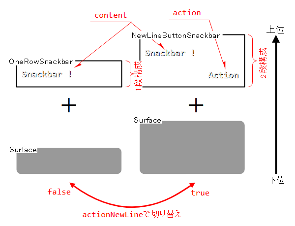
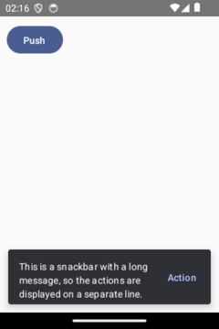
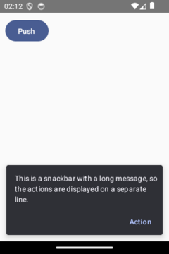
| actionOnNewLine | Boolean | Actionを別の行に分離(2段構成) false:1段構成、true:2段構成 |
| shape | Shape | 角の丸み |
| containerColor | Color | バーの色 |
| contentColor | Color | メッセージの色 |
| actionContentColor | Color | Actionの色 |
| dismissActionContentColor | Color | DismissActionの色 |
| content(タイプ2) | @Composable () -> Unit | コンテンツのスロット |
SnackbarHostState#showSnackbar
    suspend fun showSnackbar(
        message: String,
        actionLabel: String? = null,
        withDismissAction: Boolean = false,
        duration: SnackbarDuration =
            if (actionLabel == null) SnackbarDuration.Short else SnackbarDuration.Indefinite
    ): SnackbarResult = ...
| 引数 | 概要 | |
|---|---|---|
| message | String | 表示するメッセージ |
| actionLabel | String | Actionの追加とラベル名 |
| withDismissAction | Boolean | DismissActionの追加 |
| duration | SnackbarDuration | 表示時間 SnackbarDuration.Short:5秒程度 ※デフォルト SnackbarDuration.Long:10秒程度 SnackbarDuration.Indefinite:自動で閉じない |
関数の構成
Snackbar関数はSurfaceの中にOneRowSnackbarもしくはNewLineButtonSnackbarを格納する構成になっています。
この両者はactionNewLine引数により切り替わります。
※詳細は後述の「2段構成のバー」を参照
バーの配置
Scaffoldに組み込んだ場合
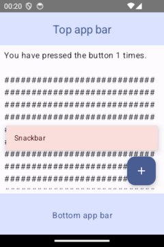
SnackbarをScaffoldに組み込んだ場合は、次の条件を満たした位置にバーが配置されます。
- (1)アプリバーとフローティングアクションボタンに重ならない
- (2)コンテンツの最上位レイヤー
単体で用いた場合
Snackbarを単体で用いる場合は、SnackbarHost(Composable関数)の表示を指定した位置にバーは配置されます。
ですので、次にあげる状況に影響を受けます。
UI要素の並び
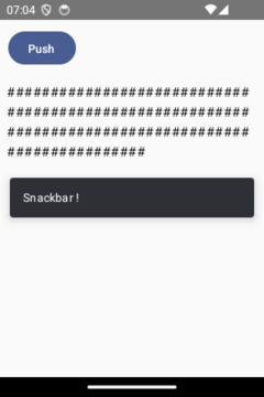
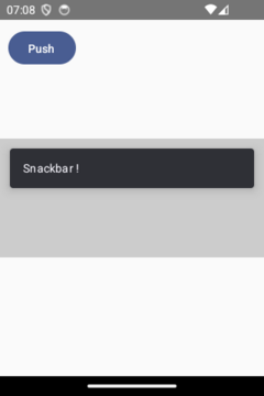
ColumnはButton⇒Text⇒SnackbarHostの縦並びにします。ですので、Textの下に配置されます。
    Column(modifier = Modifier.fillMaxSize()) {
        val _scope = rememberCoroutineScope()
        val _hostState = remember { SnackbarHostState() }

        Button(
            onClick = {
                _scope.launch {
                    _hostState.showSnackbar(message = "Snackbar !")
                }
            },
            modifier = Modifier.padding(10.dp)
        ) { Text(text = "Push") }
        Text(
            modifier = Modifier.padding(8.dp),
            text = "${DummyStr('#', 100)}"
        )
        SnackbarHost(hostState = _hostState)  // タイプ1
    }
格納するコンテナの位置
縦に並ぶ中央のBoxにSnackbarHostがあります。ですので、中央のBoxに配置されます。
    Box(modifier = Modifier.fillMaxSize()) {
        val _scope = rememberCoroutineScope()
        val _hostState = remember { SnackbarHostState() }
        Column(modifier = Modifier.fillMaxSize()) {
            Box(modifier = Modifier.weight(1.0f).fillMaxSize())
            Box(modifier = Modifier.weight(1.0f).fillMaxSize()
                .background(Color.LightGray)
            ) {
                SnackbarHost(hostState = _hostState)  // タイプ1
            }
            Box(modifier = Modifier.weight(1.0f).fillMaxSize())
        }
        Button(
            onClick = {
                _scope.launch {
                    _hostState.showSnackbar(message = "Snackbar !")
                }
            },
            modifier = Modifier.padding(10.dp)
        ) { Text(text = "Push") }
    }
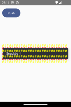
UI要素の重なり
Boxは下から赤Text⇒SnackbarHost⇒黄Textの順に重ねます。ですので、黄Textの下に配置されます。
    Box(modifier = Modifier.fillMaxSize()) {
        val _scope = rememberCoroutineScope()
        val _hostState = remember { SnackbarHostState() }

        Text(
            modifier = Modifier.padding(8.dp).align(Alignment.Center),
            color = Color.Red,
            text = "${DummyStr('#', 84)}"  // ダミー:'#'が 84文字
        )
        SnackbarHost(  // タイプ1
            hostState = _hostState,
            modifier = Modifier.align(Alignment.Center)
        )
        Text(
            modifier = Modifier.padding(8.dp).align(Alignment.Center),
            color = Color.Yellow,
            text = "${DummyStr('#', 112)}"  // ダミー:'#'が112文字
        )

        Button(
            onClick = {
                _scope.launch {
                    _hostState.showSnackbar(message = "Snackbar !")
                }
            },
            modifier = Modifier.padding(10.dp)
        ) { Text(text = "Push") }
    }
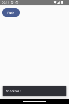
SnackbarHostのModifier.Align修飾子
Box内のUI要素はデフォルトで表示領域の左上に表示されます。しかし、Modifier.align修飾子で位置を指定できます。
SnackbarHostも同様です。
Alignment.Centerで表示領域の中央に、Alignment.BottomCenterで表示領域の下部に配置されます。
    Box(modifier = Modifier.fillMaxSize()) {
        val _scope = rememberCoroutineScope()
        val _hostState = remember { SnackbarHostState() }

        SnackbarHost(  // タイプ1
            hostState = _hostState,
//                    modifier = Modifier.align(Alignment.TopCenter),
            modifier = Modifier.align(Alignment.Center),
//                    modifier = Modifier.align(Alignment.BottomCenter)
        )
        Button(
            onClick = {
                _scope.launch {
                    _hostState.showSnackbar(message = "Snackbar !")
                }
            },
            modifier = Modifier.padding(10.dp)
        ) { Text(text = "Push") }
    }
バーの閉じ方
バーを閉じる方法は、自動と手動の2つがあります。
自動で閉じる
指定時間の経過後に自動で閉じます。
指定時間はSnackbarHostState#showSnackbar関数のduration引数で指定し、3つの時間長があります。
SnackbarDuration.Long
SnackbarDuration.Indefinite
:10秒程度
:自動で閉じない
        val _scope = rememberCoroutineScope()
        val _hostState = remember { SnackbarHostState() }

        Button(
            onClick = {
                _scope.launch {
                    _hostState.showSnackbar(
                        message = "Snackbar(Short) !",
                        duration = SnackbarDuration.Short  // デフォルト
                    )
                }
        //        _scope.launch {
        //            _hostState.showSnackbar(
        //                message = "Snackbar(Long) !",
        //                duration = SnackbarDuration.Long
        //            )
        //       }
        //        _scope.launch {
        //            _ihostState.showSnackbar(
        //                message = "Snackbar(Indefinite) !",
        //                duration = SnackbarDuration.Indefinite
        //            )
        //        }
            },
            modifier = Modifier.padding(10.dp)
        ) { Text(text = "Push") }
手動で閉じる
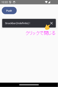
「duration = SnackbarDuration.Indefinite」を指定すると、自動で閉じなくなります。
このような場合、DismissAction(×アイコン)を付加して、手動で閉じるようにします。
        val _scope = rememberCoroutineScope()
        val _hostState = remember { SnackbarHostState() }

        Button(
            onClick = {
                _scope.launch {
                    _hostState.showSnackbar(
                        message = "Snackbar(Indefinite) !",
                        duration = SnackbarDuration.Indefinite,
                        withDismissAction = true
                    )
                }
            },
            modifier = Modifier.padding(10.dp)
        ) { Text(text = "Push") }
閉じたときの処理
SnackbarHostState#showSnackbar関数は、バーが閉じた理由を返します。
SnackbarResult.Dismissedは、自動もしくはDismissAction(×アイコン)で閉じられたことを示しています。
ですので、これを条件にすれば、バーが閉じた時の処理を追加できます。
        val _scope = rememberCoroutineScope()
        val _hostState = remember { SnackbarHostState() }

        Button(
            onClick = {
                _scope.launch {
                    val _result = _hostState.showSnackbar(
                        message = "Snackbar(Short) !",
                        duration = SnackbarDuration.Short  // デフォルト
                    )
                    when(_result) {
                        SnackbarResult.ActionPerformed -> {}
                        SnackbarResult.Dismissed -> {
                            /* バーが閉じた時の処理 */
                        }
                    }
                }
            modifier = Modifier.padding(10.dp)
        ) { Text(text = "Push") }
アクションを追加
Actionをクリックするとバーは閉じられます。
また、SnackbarHostState#showSnackbar関数は、バーが閉じた理由を返します。
SnackbarResult.ActionPerformedは、Actionをクリックすることで閉じられたことを示しています。
ですので、これを条件にすれば、Actionをクリックした時の処理を追加できます。
        val _scope = rememberCoroutineScope()
        val _hostState = remember { SnackbarHostState() }

        Button(
            onClick = {
                _scope.launch {
                    val _result =_hostState.showSnackbar(
                        message = "Snackbar(Action) !",
                        actionLabel = "Action",
                    )
                    when(_result) {
                        SnackbarResult.ActionPerformed -> {
                            /* アクションをクリックした時の処理 */
                        }
                        SnackbarResult.Dismissed -> {}
                    }
                }
            },
            modifier = Modifier.padding(10.dp)
        ) { Text(text = "Push") }
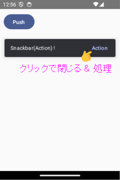
ちなみに、「actionLabel = “文字列”」に連動して「duration = SnackbarDuration.Indefinite」になります。※「関数の引数」を参照
カスタムSnackbar
Snackbarはタイプ1とタイプ2があります。
タイプ1は、DismissActionがIcon(×アイコン)、ActionがText、そして、コンテンツがTextで表現されていて、固定です。
タイプ2は、全部がスロットになっているので、自由にカスタマイズできます。
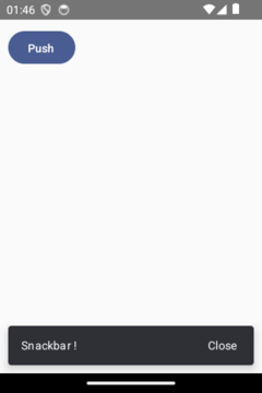
DismissActionのカスタマイズ
        val _scope = rememberCoroutineScope()
        val _hostState = remember { SnackbarHostState() }

        SnackbarHost(
            hostState = _hostState,
            modifier = Modifier.align(Alignment.BottomCenter)
        ) {
            Snackbar(  // タイプ2、itはSnackbarDataインスタンス
                modifier = Modifier.padding(10.dp),
                dismissAction = {
                    Text(
                        text = "Close",
                        modifier = Modifier.padding(end = 20.dp)
                            .clickable { it.dismiss() }  // クリックで閉じる
                    )
                }
            ) { Text(text = it.visuals.message) }
        }

        Button(
            onClick = {
                _scope.launch {
                    val _result = _hostState.showSnackbar(
                        message = "Snackbar !",
                        duration = SnackbarDuration.Indefinite
                    )
                    when(_result) {
                        SnackbarResult.ActionPerformed -> {}
                        SnackbarResult.Dismissed -> {
                            /* バーを閉じた時の処理 */
                        }
                    }
                }
            },
            modifier = Modifier.padding(10.dp)
        ) { Text(text = "Push") }
Actionのカスタマイズ
        val _scope = rememberCoroutineScope()
        val _hostState = remember { SnackbarHostState() }

        SnackbarHost(
            hostState = _hostState,
            modifier = Modifier.align(Alignment.BottomCenter)
        ) {
            Snackbar(  // タイプ2、itはSnackbarDataインスタンス
                modifier = Modifier.padding(10.dp),
                action = {
                    IconButton(onClick = { it.performAction() }) {  // クリックで閉じる
                        Icon(
                            imageVector = Icons.Filled.Settings,
                            contentDescription = "Settings"
                        )
                    }
                },
            ) {
                Text(text = it.visuals.message)
            }
        }

        Button(
            onClick = {
                _scope.launch {
                    val _result = _hostState.showSnackbar(
                        message = "Snackbar !",
                        duration = SnackbarDuration.Indefinite
                    )
                    when(_result) {
                        SnackbarResult.ActionPerformed -> {
                            /* アクションをクリックした時の処理 */
                        }
                        SnackbarResult.Dismissed -> {}
                    }
                }
            },
            modifier = Modifier.padding(10.dp)
        ) { Text(text = "Push") }
2段構成のバー
コンテンツに表示するメッセージが長い時のために、アクションを別の行へ分離することが出来ます。
        val _scope = rememberCoroutineScope()
        val _hostState = remember { SnackbarHostState() }

        Button(
            onClick = {
                _scope.launch {
                    _hostState.showSnackbar(
                        message = "This is a snackbar with a long message, ...",
                        actionLabel = "Action"
                    )
                }
            },
            modifier = Modifier.padding(10.dp)
        ) { Text(text = "Push") }

        SnackbarHost(
            hostState = _hostState,
            modifier = Modifier.align(Alignment.BottomCenter)
        ){
            Snackbar(  // タイプ1(タイプ2も同様)
                snackbarData = it,
        //        actionOnNewLine = false  // デフォルト
                actionOnNewLine = true
            )
        }
関連記事: