Compose UI:Scaffold

投稿日:  更新日:

Jetpack composeは、アプリ開発に必要な一通りのUIコンポーネントをライブラリで提供しています。

そのライブラリ中のScaffoldについて、構成や使用方法などをまとめます。

※環境:Android Studio Koala | 2024.1.1
    Kotlin 1.9.0
    Compose Compiler 1.5.1
    androidx.compose.material3:material3 1.1.1

スポンサーリンク

UIの概要

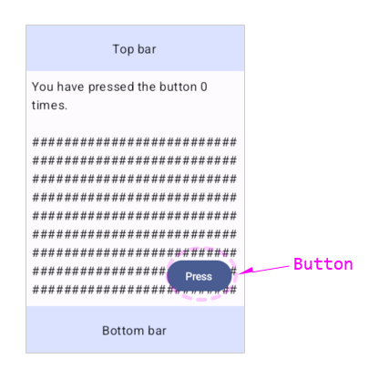
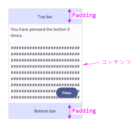
Scaffoldはアプリケーション画面のテンプレートです。

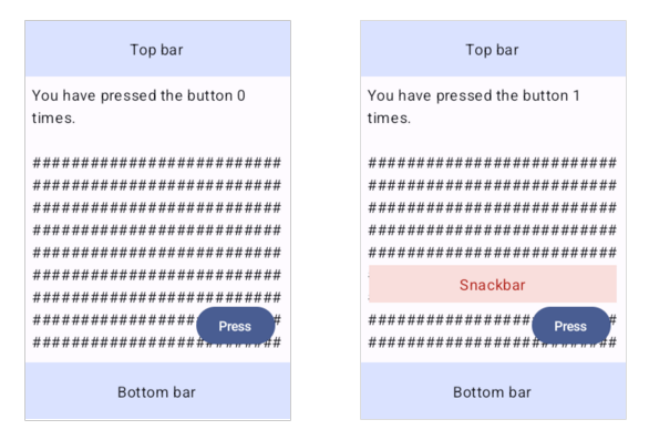
「トップバー、ボトムバー、アクションボタン、スナックバー、コンテンツ」といった5つの表示要素を、下図のように配置します。

Scaffoldのサンプル

Scaffoldのサンプル
class MainActivity : ComponentActivity() {
    override fun onCreate(savedInstanceState: Bundle?) {
        super.onCreate(savedInstanceState)
        enableEdgeToEdge()
        setContent {
            AppTheme {
                var presses by remember { mutableIntStateOf(0) }
                val scope = rememberCoroutineScope()
                val snackbarHostState = remember { SnackbarHostState() }
                Scaffold(
                    modifier = Modifier.fillMaxSize(),
                    topBar = {
                        Box(        // 自作トップバー
                            modifier = Modifier
                                .fillMaxWidth()
                                .height(60.dp)
                                .background(color = MaterialTheme.colorScheme.primaryContainer),
                            contentAlignment = Alignment.Center
                        ) { Text(text = "Top bar") }
                    },
                    bottomBar = {
                        Box(        // 自作ボトムバー
                            modifier = Modifier
                                .fillMaxWidth()
                                .height(60.dp)
                                .background(color = MaterialTheme.colorScheme.primaryContainer),
                            contentAlignment = Alignment.Center
                        ) { Text(text = "Bottom bar") }
                    },
                    snackbarHost = {
                        SnackbarHost(hostState = snackbarHostState) {
                            Box(
                                modifier = Modifier
                                    .fillMaxWidth()
                                    .height(40.dp)
                                    .padding(horizontal = 10.dp)
                                    .background(color = MaterialTheme.colorScheme.errorContainer),
                                contentAlignment = Alignment.Center
                            ) {
                                Text(
                                    text = it.visuals.message,
                                    color = MaterialTheme.colorScheme.error
                                )
                            }
                        }
                    },
                    floatingActionButton = {
                        Button(    // 自作アクションボタン
                            onClick = {
                                presses++
                                scope.launch {
                                    snackbarHostState.showSnackbar("Snackbar")
                                }
                            }
                        ) { Text(text = "Press") }
                    }
                ) { innerPadding ->
                    Column(
                        modifier = Modifier.padding(innerPadding),
                        verticalArrangement = Arrangement.spacedBy(16.dp),
                    ) {
                        Text(
                            modifier = Modifier.padding(8.dp),
                            text =
                            """
                                You have pressed the button $presses times.
                    
                                ${DummyStr('#', 500)}   // ダミー:'#'が500文字
                            """.trimIndent(),
                        )
                    }
                }
            }
        }
    }

    override fun onStart() {
        super.onStart()
        // システムバーを非表示
        WindowCompat.getInsetsController(window, window.decorView).apply {
            hide(WindowInsetsCompat.Type.systemBars())
            systemBarsBehavior = WindowInsetsControllerCompat.BEHAVIOR_DEFAULT
        }
    }
}

この画面構成は「Material Designe」の指標に準拠しています。

アプリの見た目と操作性を共通化して、ユーザエクスペリエンス(使い心地)を向上させる目的を持ちます。

スポンサーリンク

関数の引数

Scaffoldの状態(装飾、演出など)は、引数により指定できます。

@Composable
fun Scaffold(
    modifier: Modifier = Modifier,
    topBar: @Composable () -> Unit = {},
    bottomBar: @Composable () -> Unit = {},
    snackbarHost: @Composable () -> Unit = {},
    floatingActionButton: @Composable () -> Unit = {},
    floatingActionButtonPosition: FabPosition = FabPosition.End,
    containerColor: Color = MaterialTheme.colorScheme.background,
    contentColor: Color = contentColorFor(containerColor),
    contentWindowInsets: WindowInsets = ScaffoldDefaults.contentWindowInsets,
    content: @Composable (PaddingValues) -> Unit
) { ... }
引数概要
modifierModifierUI全般のCompose修飾子
topBar@Composable () -> Unitトップバーのスロット
bottomBar@Composable () -> Unitボトムバーのスロット
snackbarHost@Composable () -> Unitスナックバーのスロット
floatingActionButton@Composable () -> UnitFABのスロット
floatingActionButtonPositionFabPositionFABの位置
 End:右端
 Center:中央
containerColorColorコンテンツの背景色
contentColorColorコンテンツの主色
contentWindowInsetsWindowInsetsバー部分のサイズ情報
content@Composable (PaddingValues) -> Unitコンテンツのスロット
※スロット:UIの表示を司るコマンドブロック(Composable関数)を入力する引数

スロットとは「UIの表示を司るコマンドブロック(Composable関数)を代入する引数」のことです。Scaffoldは「5つのスロットを持つ関数」になります。

スポンサーリンク

関数の構成

ScaffoldはSurfaceでパネル(バックグラウンド)を作成した上に、トップバー、ボトムバー、アクションボタン、スナックバー、コンテンツを配置する構成になっています。

ScaffoldLayout関数(Composable関数)は、描画処理のレイアウトフェーズで呼び出され、上記5つの表示要素の配置を決める処理を、システムへ登録します。
※描画処理については「Jetpack Compose:Composeによるアプリ画面の描画」を参照

@Composable
fun Scaffold(
    modifier: Modifier = Modifier,
    ...
	containerColor: Color = MaterialTheme.colorScheme.background,
    contentColor: Color = contentColorFor(containerColor),
	...
) {
    Surface(modifier = modifier, color = containerColor, contentColor = contentColor) {
        ScaffoldLayout(
            fabPosition = floatingActionButtonPosition,
            topBar = topBar,
            bottomBar = bottomBar,
            content = content,
            snackbar = snackbarHost,
            contentWindowInsets = contentWindowInsets,
            fab = floatingActionButton
        )
    }
}

ScaffoldはSurfaceを含みます。ですので、Android Studio(New Project)の作成するプロジェクトにおいて、Surface階層は不要です。

最新版のAndroid Studioは、デフォルトでScaffoldを使用する記述が出力されます。

Android Studio≧JellyfishAndroid Studio<Jellyfish
class MainActivity : ComponentActivity() {
    override fun onCreate(savedInstanceState: Bundle?) {
        super.onCreate(savedInstanceState)
        enableEdgeToEdge()
        setContent {
            AppTheme {
                Scaffold(modifier = Modifier.fillMaxSize()) { innerPadding ->
				    /*
					** コンテンツ
					*/
                }
            }
        }
    }
}
class MainActivity : ComponentActivity() {
    override fun onCreate(savedInstanceState: Bundle?) {
        super.onCreate(savedInstanceState)
        setContent {
            AppTheme {
//                Surface(
//                    modifier = Modifier.fillMaxSize(),
//                    color = MaterialTheme.colorScheme.background
//                ) {
                	Scaffold(...) { ... }
//                }
            }
        }
    }
}
スポンサーリンク

トップバーのスロット(topBar)

スロットへトップバーのUIを記述します。

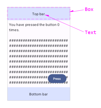
以下はBoxとTextでトップバーを自作した例です。

    Scaffold(
	...
        topBar = {
            Box(
                modifier = Modifier
                    .fillMaxWidth()
                    .height(60.dp)
                    .background(color = MaterialTheme.colorScheme.primaryContainer),
                contentAlignment = Alignment.Center
            ) {
                Text(text = "Top bar")
            }
        },
	...
	) { ... }

トップバーのサンプル

自作も可能ですが、「Material Designe」の指標に準拠したTopAppBar(Composable関数)がAPIに準備されています。こちらを使った方が容易です。
※TopAppBarについては「Compose UI:TopAppBar」を参照

スポンサーリンク

ボトムバーのスロット(bottomBar)

スロットへボトムバーのUIを記述します。

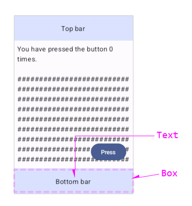
以下はBoxとTextでボトムバーを自作した例です。

    Scaffold(
	...
        bottomBar = {
            Box(
                modifier = Modifier
                    .fillMaxWidth()
                    .height(60.dp)
                    .background(color = MaterialTheme.colorScheme.primaryContainer),
                contentAlignment = Alignment.Center
            ) {
                Text(text = "Bottom bar")
            }
        },
	...
	) { ... }

ボトムバーのサンプル

自作も可能ですが、「Material Designe」の指標に準拠したBottomAppBar(Composable関数)がAPIに準備されています。こちらを使った方が容易です。
※BottomAppBarについては「Compose UI:BottomAppBar」を参照

スポンサーリンク

アクションボタンのスロット(floatingActionButton)

スロットへアクションボタンのUIを記述します。

以下はButtonでアクションボタンを自作した例です。

    var presses by remember { mutableIntStateOf(0) }

    Scaffold(
	...
        floatingActionButton = {
            Button(
                onClick = {
                    presses++
                    scope.launch {  	// スナックバー呼出し
                        snackbarHostState.showSnackbar("Snackbar")
                    }
                }
            ) {
                Text(text = "Press")
            }
        },
	...
	) { ... }

アクションボタンのサンプル

自作も可能ですが、「Material Designe」の指標に準拠したFloatingActionButton(Composable関数)がAPIに準備されています。こちらを使った方が容易です。
※FloatingActionButtonについては「Compose UI:FloatingActionButton」を参照

スポンサーリンク

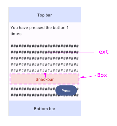
スナックバーのスロット(snackbarHost)

スロットへSnackbarHostを記述します。これはScaffoldへスナックバーを組み込む場合の定型です。

Scaffaoldへ組み込まれたスナックバーは、コンテンツの上、かつ、トップバー・ボトムバー・アクションボタンに重ならない位置へ表示するように、制御されます。

@Composable
fun SnackbarHost(
    hostState: SnackbarHostState,	// 表示の状態管理/起動ポイント(showSnackbar)の設置
    modifier: Modifier = Modifier,
    snackbar: @Composable (SnackbarData) -> Unit = { Snackbar(it) }  // 形状の定義(スロット)
) { ... }

さらに、SnackbarHostのsnackbarスロットへバー本体のUIを記述(形状の定義)します。2重のスロットになっています。

以下はBoxとTextでスナックバーを自作した例です。

    val scope = rememberCoroutineScope()
    val snackbarHostState = remember { SnackbarHostState() }
	
    Scaffold(
	...
        snackbarHost = {
            SnackbarHost(hostState = snackbarHostState) {
                Box(
                    modifier = Modifier
                        .fillMaxWidth()
                        .height(40.dp)
                        .padding(horizontal = 10.dp)
                        .background(color = MaterialTheme.colorScheme.errorContainer),
                    contentAlignment = Alignment.Center
                ) {
                    Text(
                        text = it.visuals.message,
                        color = MaterialTheme.colorScheme.error
                    )
                }
            }
        },
	...
	) { ... }

スナックバーのサンプル

自作も可能ですが、「Material Designe」の指標に準拠したSnackbar(Composable関数)がAPIに準備されています。こちらを使った方が容易です。
※Snackbarについては「Compose UI:Snackbar」を参照

スポンサーリンク

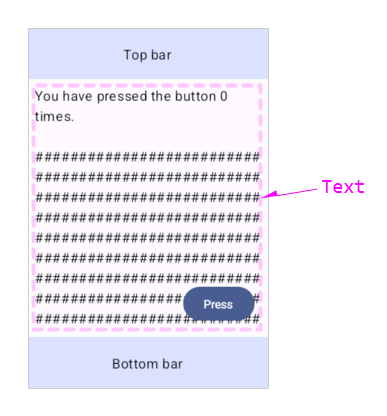
コンテンツのスロット( content )

スロットへコンテンツのUIを記述します。

以下はTextのみで構成されたコンテンツの例です。

    var presses by remember { mutableIntStateOf(0) }

    Scaffold(
	...
    ) { innerPadding ->
        Column(
            modifier = Modifier.padding(innerPadding),
            verticalArrangement = Arrangement.spacedBy(16.dp),
        ) {
            Text(
                modifier = Modifier.padding(8.dp),
                text =
                """
                    You have pressed the button $presses times.
                    
                    ${DummyStr('#', 500)}   // ダミー:'#'が500文字
                """.trimIndent(),
            )
        }
    }

コンテンツのサンプル

スポンサーリンク

innerPaddingの働き

コンテンツのスロットは引数にinnerPaddingを持ちます。

以下は、このinnerPaddingを使用しない例です。

    var presses by remember { mutableIntStateOf(0) }

    Scaffold(
	...
    ) { innerPadding ->
        Column(
//            modifier = Modifier.padding(innerPadding),
            verticalArrangement = Arrangement.spacedBy(16.dp),
        ) {
            Text(
                modifier = Modifier.padding(8.dp),
                text =
                """
                    You have pressed the button $presses times.
                    
                    ${DummyStr('#', 500)}   // ダミー:'#'が500文字
                """.trimIndent(),
            )
        }
    }

innerPaddingを使用しない

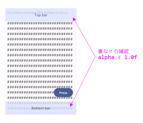
このサンプルからわかるように、innerPaddingはコンテンツの上下にスペースを設けて、トップバーならびにボトムバーとコンテンツの重なりを避ける働きをしています。

innerPaddingを使用する

また、台紙に写真を貼る(挿入する)場合に設ける上下左右の余白をインセットと言います。

インセットの意味

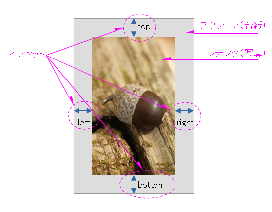
ですので、innerPaddingはスクリーンへコンテンツを貼る場合のインセットです。

スポンサーリンク

画面のプレビュー(@Preview)

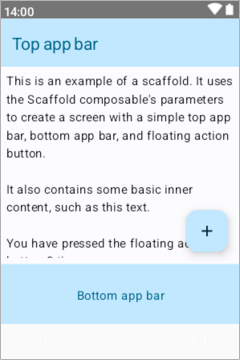
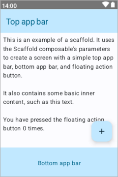
Scaffoldを使用したアプリケーション画面のプレビューを行うと、画面の下部に空欄が出来てしまいます。

これは、innerPaddingを使うことでインセットが指定された結果です。

この空欄はナビゲーションバーが入ります。プレビューはナビゲーションバーを表示できないため、空欄になってしまうようです。
※ナビゲーションバーについては「Android EmulatorでNavigation Barを表示」を参照

@Preview(showBackground = true, showSystemUi = true)
@Composable
private fun ScaffoldPreview() {
    AppTheme {
        ScaffoldExample()	// Scaffoldを使用したTop階層
    }
}
 ナビゲーションキーのない端末 
【プレビュー(@Preview)】

ナビゲーションキーのない端末でプレビュー
【エミュレーション(AVD)】

ナビゲーションキーのない端末でエミュレーション

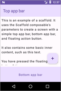
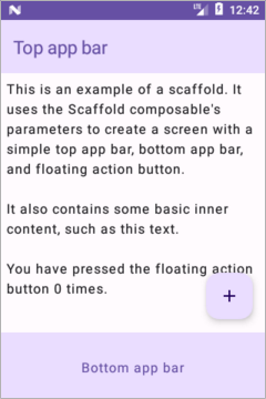
ナビゲーションキーのある端末(ハードのボタンを持つ端末)をプレビュー対象のデバイスに指定すれば、空欄は出来ません。
※プレビューについては 「Jetpack Compose:画面のプレビュー(@Preview)」を参照

    :
hw.mainKeys=yes		# yes:HWのナビキーあり / no:HWのナビキーなし
    :
@Preview(showBackground = true, showSystemUi = true, device = "id:NavKeyO")
@Composable
private fun ScaffoldPreview() {
    AppTheme {
        ScaffoldExample()	// Scaffoldを使用したTop階層
    }
}
 ナビゲーションキーのあり端末 
【プレビュー(@Preview)】

ナビゲーションキーのある端末でプレビュー
【エミュレーション(AVD)】

ナビゲーションキーのある端末でエミュレーション
スポンサーリンク

関連記事:

Jetpack composeは、アプリ開発に必要な一通りのUIコンポーネントをライブラリで提供しています。 そのライブラリ中のButtonについて、構成や使用方法などをまとめます。 ※環境:Android Studio Flamingo | 2022.2.1    :androidx.compose.material3:material3:1.1.1    :androidx.compose.ui:ui:1.4.3 ...
Jetpack composeは、アプリ開発に必要な一通りのUIコンポーネントをライブラリで提供しています。 そのライブラリ中のSurfaceについて、構成や使用方法などをまとめます。 ※環境:Android Studio Flamingo | 2022.2.1    :androidx.compose.material3:material3:1.1.1    :androidx.compose.ui:ui:1.4.3 ...
Jetpack composeは、アプリ開発に必要な一通りのUIコンポーネントをライブラリで提供しています。 そのライブラリ中のRadioButtonについて、構成や使用方法などをまとめます。 ※環境:Android Studio Hedgehog | 2023.1.1     Kotlin 1.8.10     Compose Compiler 1.4.3 ...
Jetpack composeは、アプリ開発に必要な一通りのUIコンポーネントをライブラリで提供しています。 そのライブラリ中にUI要素を格納する機能をもつコンテナ型のUIがあります。 Column/Row/Boxがコンテナ型のUIです。構成や使用方法などをまとめます。 ※環境:Android Studio Hedgehog | 2023.1.1 Patch 1     Kotlin 1.8.10     Compose Compiler 1.4.3 ...
Jetpack composeは、アプリ開発に必要な一通りのUIコンポーネントをライブラリで提供しています。 そのライブラリ中のImageについて、構成や使用方法などをまとめます。 ※環境:Android Studio Hedgehog | 2023.1.1 Patch 2     Kotlin 1.9.0     Compose Compiler 1.5.1     androidx.compose.foundation 1.5.0 ...
Jetpack composeは、アプリ開発に必要な一通りのUIコンポーネントをライブラリで提供しています。 そのライブラリ中のDividerについて、構成や使用方法などをまとめます。 ※環境:Android Studio Hedgehog | 2023.1.1 Patch 2     Kotlin 1.9.0     Compose Compiler 1.5.1     androidx.compose.material3:material3 1.1.1 ...
Jetpack composeは、アプリ開発に必要な一通りのUIコンポーネントをライブラリで提供しています。 そのライブラリ中のSpacerについて、構成や使用方法などをまとめます。 ※環境:Android Studio Hedgehog | 2023.1.1 Patch 2     Kotlin 1.9.0     Compose Compiler 1.5.1     androidx.compose.foundation 1.5.0 ...
Jetpack composeは、アプリ開発に必要な一通りのUIコンポーネントをライブラリで提供しています。 そのライブラリ中のSliderについて、構成や使用方法などをまとめます。 ※環境:Android Studio Hedgehog | 2023.1.1 Patch 2     Kotlin 1.9.0     Compose Compiler 1.5.1     androidx.compose.material3:material3 1.1.1 ...
Jetpack composeは、アプリ開発に必要な一通りのUIコンポーネントをライブラリで提供しています。 そのライブラリ中のTopAppBarについて、構成や使用方法などをまとめます。 ※環境:Android Studio Koala | 2024.1.1     Kotlin 1.9.0     Compose Compiler 1.5.1     androidx.compose.material3:material3 1.1.1 ...
Jetpack composeは、アプリ開発に必要な一通りのUIコンポーネントをライブラリで提供しています。 そのライブラリ中のBottomAppBarについて、構成や使用方法などをまとめます。 ※環境:Android Studio Koala | 2024.1.1     Kotlin 1.9.0     Compose Compiler 1.5.1     androidx.compose.material3:material3 1.1.1 ...
Jetpack composeは、アプリ開発に必要な一通りのUIコンポーネントをライブラリで提供しています。 そのライブラリ中のFloatingActionButtonについて、構成や使用方法などをまとめます。 ※環境:Android Studio Koala | 2024.1.1     Kotlin 1.9.0     Compose Compiler 1.5.1     androidx.compose.material3:material3 1.1.1 ...
Jetpack composeは、アプリ開発に必要な一通りのUIコンポーネントをライブラリで提供しています。 そのライブラリ中のSnackbarについて、構成や使用方法などをまとめます。 ※環境:Android Studio Koala | 2024.1.1     Kotlin 1.9.0     Compose Compiler 1.5.1     androidx.compose.material3:material3 1.1.1 ...
Jetpack composeは、アプリ開発に必要な一通りのUIコンポーネントをライブラリで提供しています。 そのライブラリ中のLazyColumnについて、構成や使用方法などをまとめます。 ※環境:Android Studio Koala | 2024.1.1     Kotlin 1.9.0     Compose Compiler 1.5.1     androidx.compose.foundation:foundation 1.6.8 ...
Jetpack composeは、アプリ開発に必要な一通りのUIコンポーネントをライブラリで提供しています。 そのライブラリ中のLazyRowについて、構成や使用方法などをまとめます。 ※環境:Android Studio Koala | 2024.1.1 Patch 1     Kotlin 1.9.0     Compose Compiler 1.5.1     androidx.compose.foundation:foundation 1.6.8 ...
スポンサーリンク